The kitchens below range from a weekend hardware swap and open shelving on existing cabinets to full-order lacquer and integrated panels that need weeks and a professional install.
The one thing that decides which idea is yours is whether you are living in the space while you do it.
Start with the pull-out shelves, the slim brass pulls, and the integrated toe-kick lighting; the taupe high-gloss lacquer and the curved drawer corners can wait until you have a backup kitchen.
The 2700K LED strip under the toe-kick is what I would wire first: it makes base cabinets look like they are floating after dark, and one weekend of work costs less than a single pendant.
[link-whisper-related-posts]1. Neutral Color Kitchen Cabinets
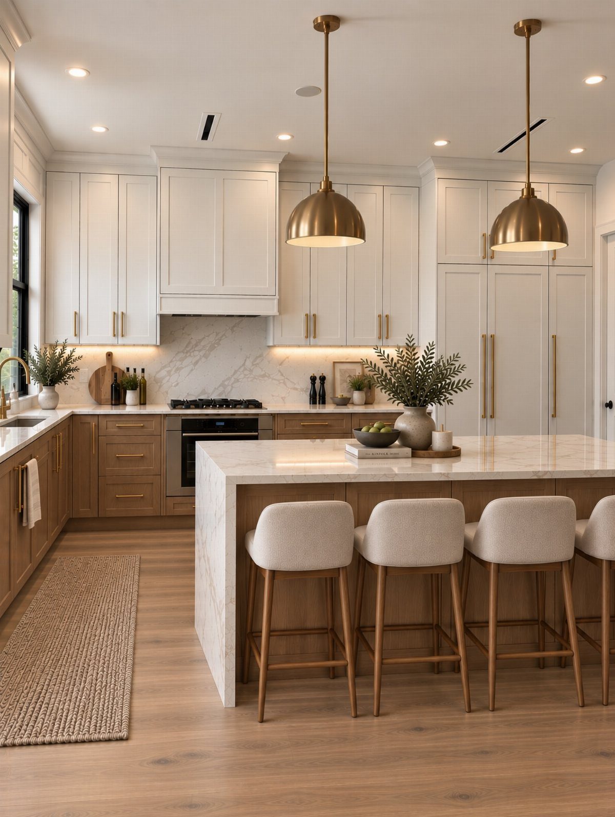
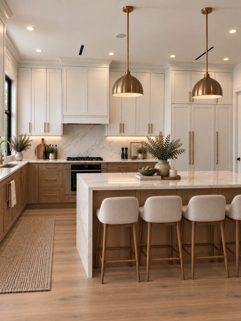
Soft white uppers paired with light wood bases keep a kitchen calm without going cold. The brass hardware warms both finishes and ties them to the pendants overhead.
I like this split because it breaks up a wall of one color without adding risk. The marble island does the heavy lifting for personality, so the cabinets can stay quiet.
“The best way to modernize your kitchen inexpensively is with your color palette,” says Alex Yacavone, Kohler design studio manager.
2. Skylights
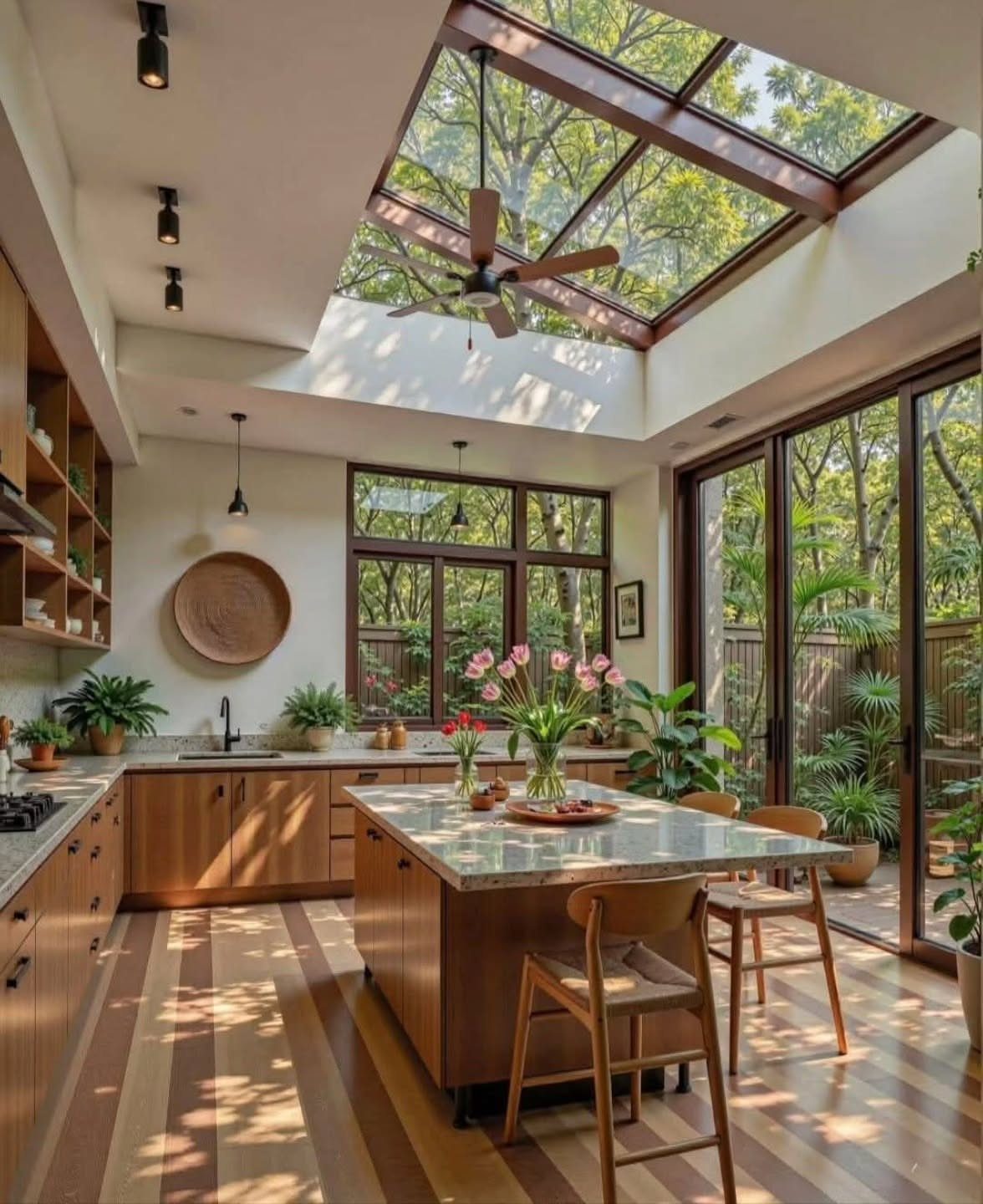
A single large skylight over the work zone turns morning into usable light, especially if your kitchen faces north or sits deep in the floor plan.
The wood cabinets here read warmer under it than they would under recessed cans alone.
The fan below it keeps summer from turning the glass into a heat trap. If your roof geometry allows one, I would center it over the island or the sink, not the perimeter where wall cabinets cast shadows.
3. Unique Lighting Fixtures
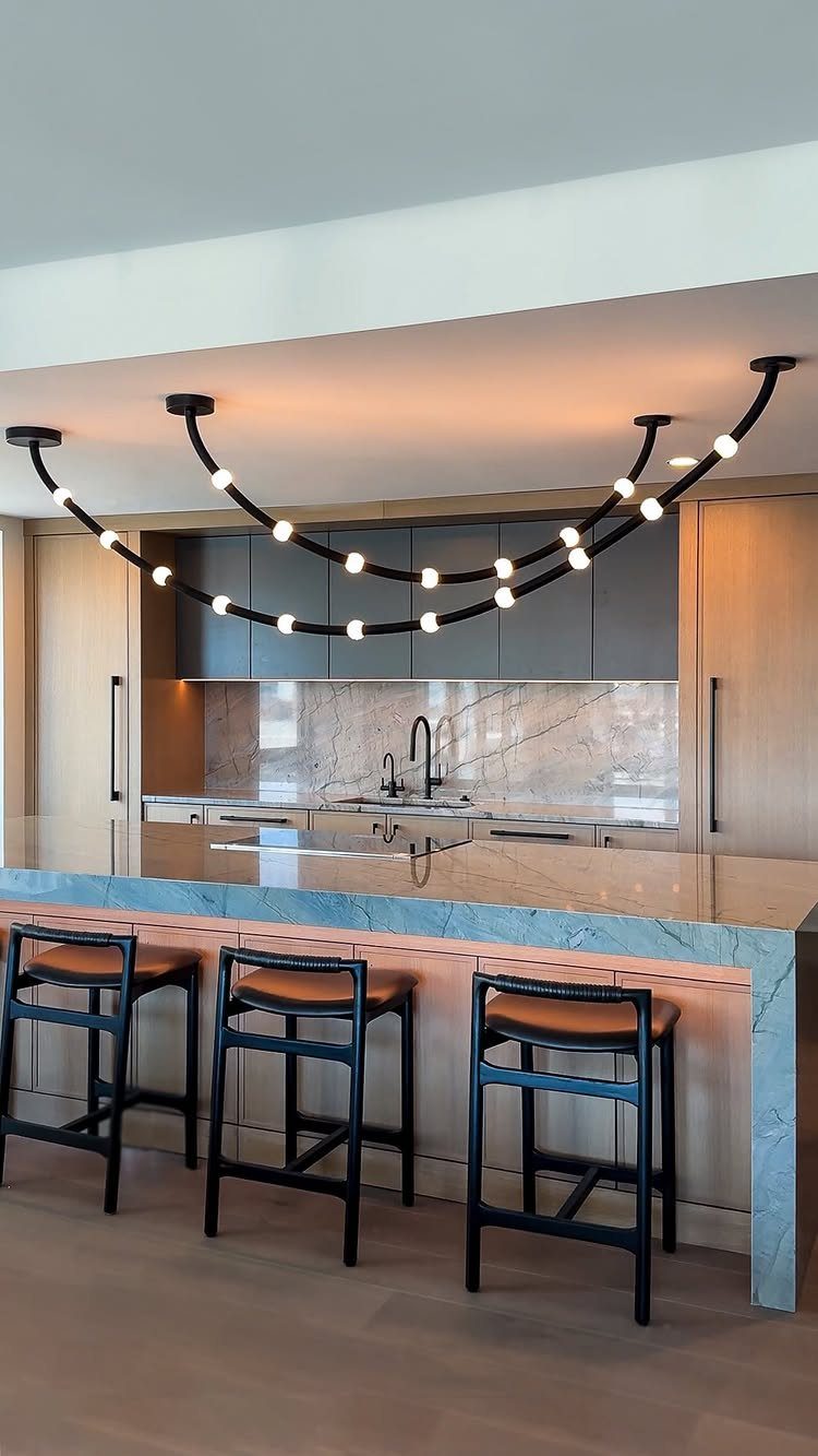
The fixture here is doing the work of a sculpture: it gives the kitchen its single bold shape in a room otherwise built from rectangles. A round or curved light over a rectangular island creates that tension on purpose.
I would hang it low enough to feel intimate over the island but high enough to not block sightlines across the room, which usually lands around eye level for someone seated at the counter.
Dimmer switch required; a statement piece at full brightness is a mistake I have seen too often.
4. Minimalist Cabinetry
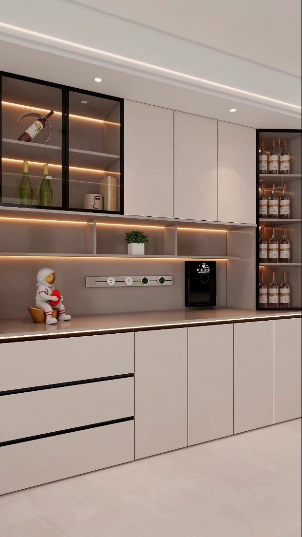
Flat panels, no handles on the lowers, and a thin LED strip tucked where the wall meets the cabinet face: this is the detail that makes handleless work.
Without that light, the line reads as missing hardware rather than as a choice.
The glass-front uppers in this kitchen keep it from feeling too controlled. I would use them for one thing only, wine bottles or a single color of dishware; clutter undoes the whole effect.
5. Pull-out Shelves and Deep Drawers
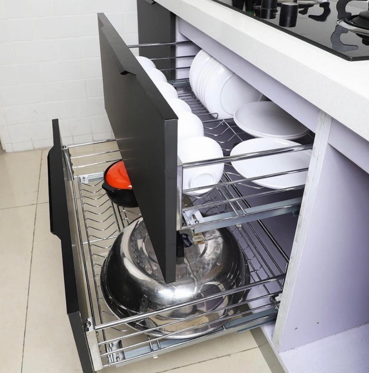
A full-extension drawer at counter height lets you lift a heavy pot straight up instead of reaching deep into a base cabinet and dragging it out. Wire organizers keep plates upright and visible; no lost lids, no stacked chaos.
Deep drawers cost more than standard bases, but I would put them under every primary prep zone and the cooktop. Reserve hinged doors for the sink base and anywhere you store tall items a drawer cannot fit.
6. Bold Accent Color Cabinets
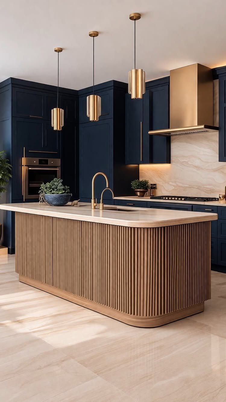
Navy across all bases, brass on every pull, gold on the hood: this kitchen commits to its color instead of dabbling. The fluted wood island then reads as texture instead of as a second competing statement.
Bold color needs restraint elsewhere.
Here the stone counters stay quiet and the walls stay absent. I would not add patterned tile or a second metal finish; the navy already did the work.
7. Two-tone Cabinets
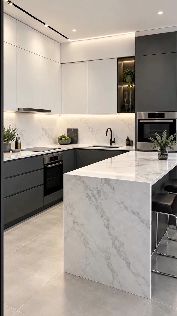
White uppers and dark lowers split the kitchen at the work zone, where the countertop meets the eye. I like this break because it hides scuffs on the bases while the uppers stay bright near the ceiling.
The waterfall island here carries the darker tone through the center, so the room holds together.
I would keep both colors in the same family, warm with warm or cool with cool; 2 clean neutrals from opposite sides clash more than a bold color pair ever would.
8. Glass Cabinets
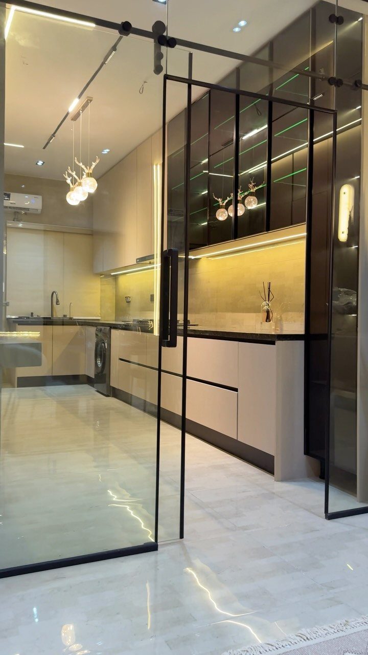
Black-framed glass uppers with interior lighting turn storage into display without the dust problem of open shelves. The frames here are thin enough to read as lines, not mass.
I would use them at an end run or over a buffet zone, never for the full kitchen; dishes you use daily do not stay pretty enough.
The shelf lighting matters more than the frame finish: without it, glass at night turns into a dark mirror that closes the room in.
9. White Subway Tiles
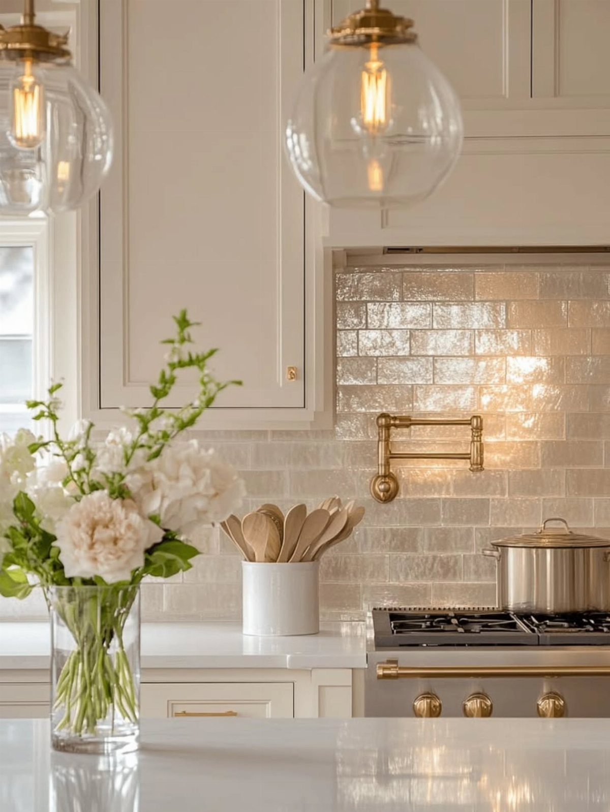
Glossy white subway tile with gray grout costs less per square foot than most patterned options and lasts until you tire of it, not until it wears out.
The running bond layout here, offset by half a tile, is the classic for a reason: it forgives walls that are not perfectly flat.
Brass or black grout with white tile risks dating fast. I would stay with light gray grout and spend the savings on a pot filler or better hardware; the tile should ground the room, not be the event.
10. Soft Green Kitchen Cabinets
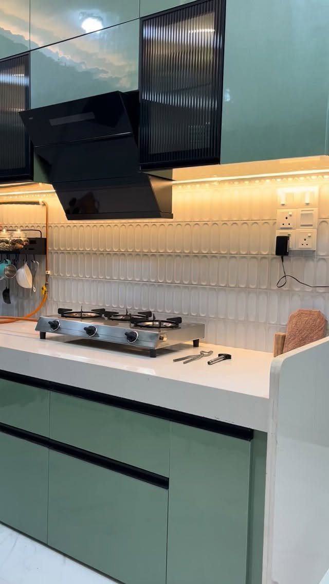
Sage gloss reads as color without the commitment of navy or emerald. The high sheen here keeps it modern; matte sage slips toward cottage faster than most greens can handle.
I would pair it with warm white counters, not cool, since the color already pulls from outside light.
Stainless appliances work against it; black or panel-ready fits better. One warning: green shifts hard under different bulbs, so test your sample at night under your actual fixtures before you order.
11. High-gloss Lacquer Cabinets
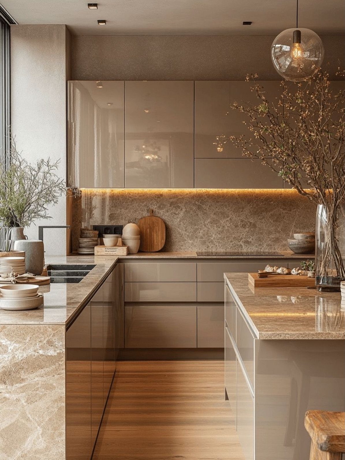
Reflective lacquer bounces light around a kitchen that gets only one window or faces another building. Taupe gloss warms up a kitchen in a way white gloss rarely manages; the finish stays bright but stops short of clinical.
The finish shows every fingerprint and needs a specific cleaner, not all-purpose spray.
I would reserve it for uppers or an island, not full height in a house with kids. The reflection also doubles whatever view you have, so aim it at something worth seeing.
12. Open Shelving
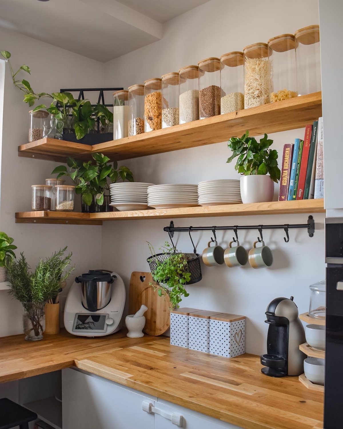
2 tiers of wood shelves in a corner hold daily dishes within arm’s reach and cost a fraction of wall cabinets. The butcher block base here matches the shelf material, which keeps the corner from feeling like an afterthought.
The Polish cookbook spine is a nice accident, but do not plan your display around books; they gather grease.
Every item on open shelving gets washed more often, which is either a feature or a burden depending on who does the dishes.
13. Sleek Cabinet Hardware
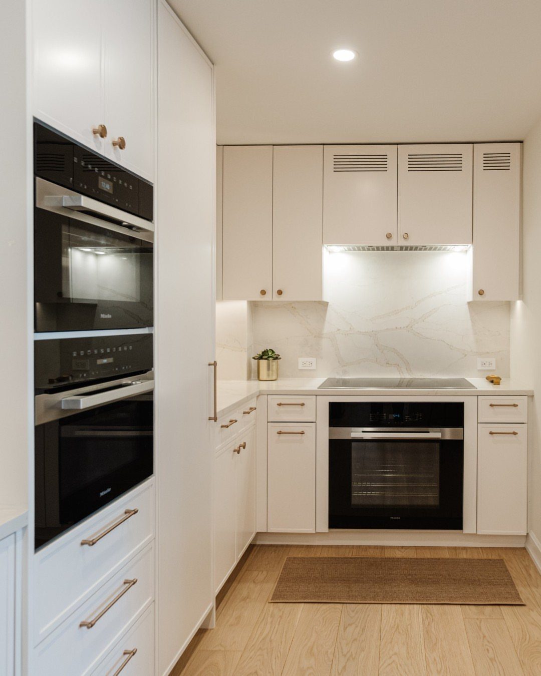
Long pulls in slim brass run the full height of slab cabinet doors and need no other hardware. The grip sits at the top corner for uppers and the bottom corner for bases, so one hand opens any door.
Knobs read as dots against flat panels; I would use pulls everywhere for consistency.
The finish here is polished, not satin, which means water spots need wiping but the metal stays alive. Matte brass goes flat and stays that way.
14. Sleek Countertops
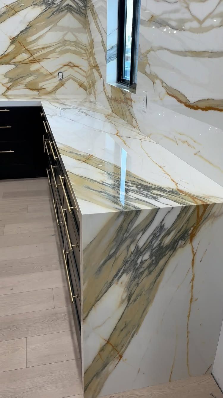
A waterfall edge carries the same stone down both sides of an island, turning a work surface into a solid block.
Gold-veined marble can tie the island to the rest of the kitchen when you match it to the hardware finish.
Polished finishes show every ring and knife mark; honed hides use but costs more and needs sealing sooner.
I would spend the extra for honed on a kitchen island that doubles as a table, where people sit close enough to notice.
15. Waterfall Countertops
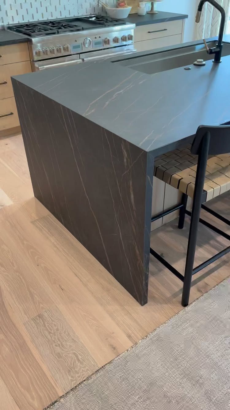
Marble-look quartz with dark veining drops straight to the floor on the island end, no cabinet side to catch light or collect crumbs. The seam sits at the inside corner, invisible from the room.
The wrapped edge eats floor space; plan for the counter to sit deeper into the room than a standard slab would.
In a galley kitchen I would stop at a standard edge and put the drama where traffic passes through, not where it compresses.
16. Integrated Toe-kick and Under-cabinet Lighting
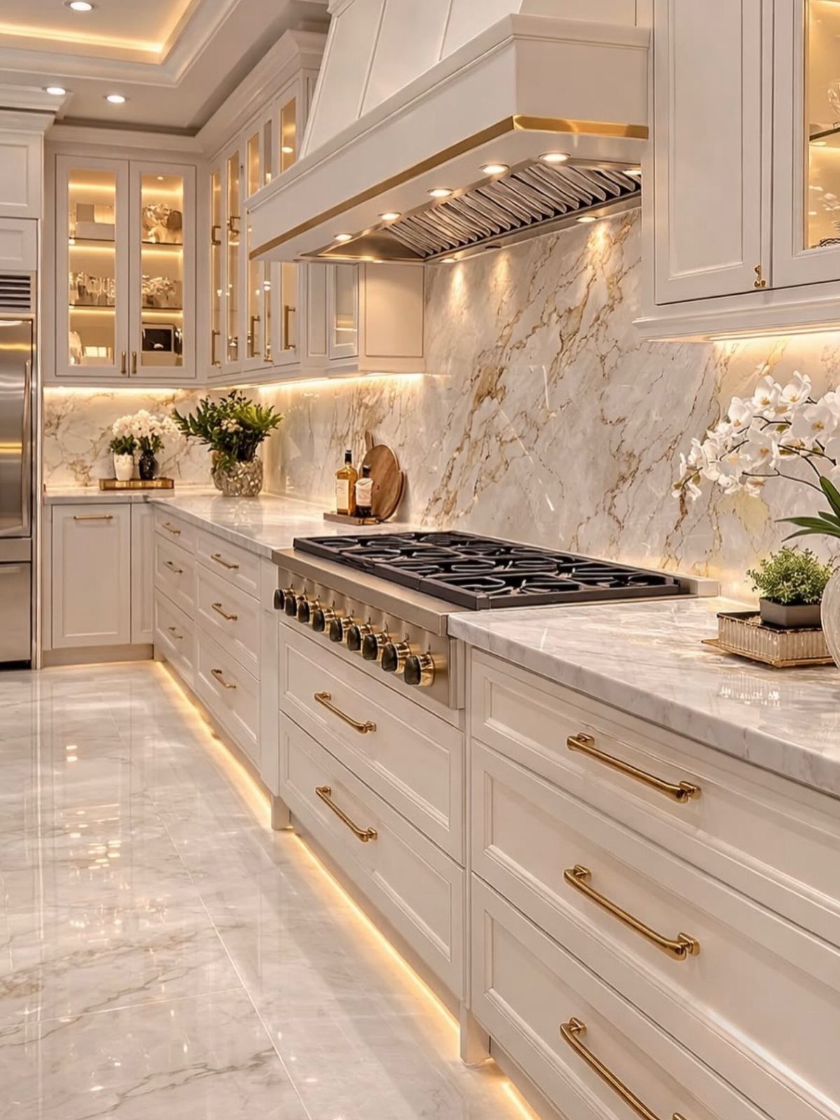
LED strip in warm 2700K tucked under the toe-kick turns base cabinets into floating masses after dark. The same strip under wall cabinets keeps the counter lit without a pendant in your sightline.
Dimmer on both circuits; full toe-kick brightness reads as nightclub, not kitchen.
I would wire them to one switch near the entry so the room greets you, not a black cave. The color temperature matters more than brightness: 3000K feels like a showroom, 2700K like a home.
17. Handleless Light Grey Cabinetry
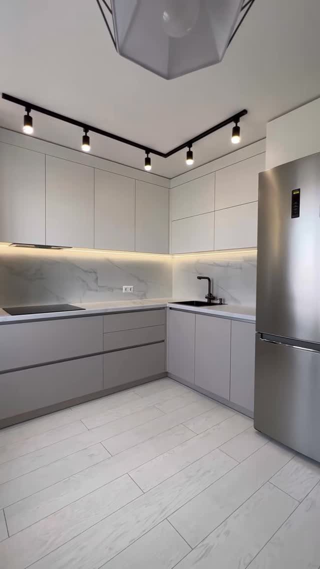
Recessed grip rails routed into the top edge of every lower door keep the face uninterrupted. Light grey lacquer here does not read as stark; it shifts from cool morning to warm evening light without looking dirty.
The ledge that replaces a pull collects dust and cooking film, so the grey needs wiping weekly, not yearly.
Panel-ready appliances with the same finish complete the wall; the stainless refrigerator that is actually there reads as a hole in the surface, which is exactly why I would have gone with a fully integrated unit instead.
18. Integrated Panel-ready Appliance Cabinets
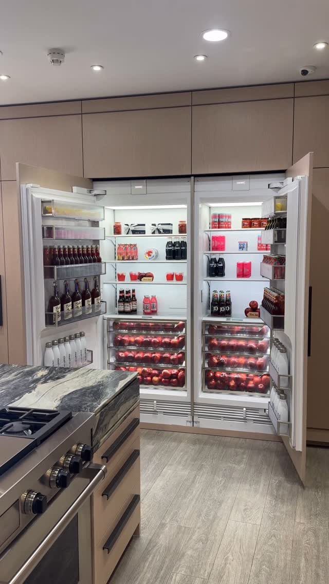
Matching cabinet panels on full-size refrigerators disappear the appliance into the run, so the wall reads as architecture, not a lineup of machines.
The column units here sit flush, no proud hinges or handles, which means precise installation within an eighth of an inch.
Built-in compressors run quieter than freestanding ones, and the custom panels add cost on top. I would panel only the refrigerator and use a standard range; the cooking surface shows anyway, and the savings buy better ventilation.
19. Modern Light Wood Cabinetry
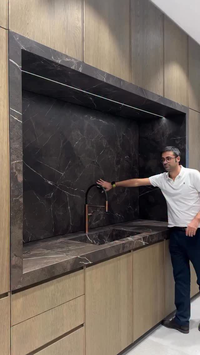
Flat-panel doors in pale oak or ash keep grain visible without going rustic. The dark marble recess behind the counter creates depth the wood alone cannot; together they read as designed, not assembled.
I would run the wood on every surface the eye meets at standing height and reserve dark stone for the backsplash plane only.
Full-height wood to the ceiling warms a kitchen but asks for cathedral height to carry it; in a standard room, stop the cabinets short and paint the gap same as the wall.
20. Curved Kitchen Drawers
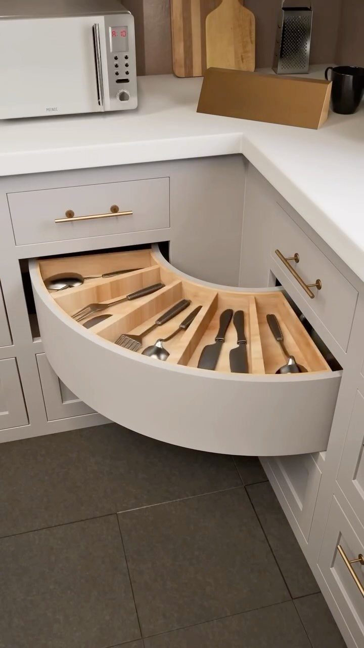
A curved front on a corner drawer turns dead space into reachable storage that a standard sharp corner joint wastes. The wooden organizer inside matches the drawer shape, which means every slot gets used; no triangular voids where spatulas disappear.
The radius needs planning during cabinet order, not after installation. I would use this for a prep zone corner where you stand, not for a base under the sink where plumbing fights for room.
The grey lacquer here hides the seam where curve meets straight rail; painted finishes show it and need touch-up within a year.
Choosing the Right Finishes
The finish sets whether your kitchen reads as designed or as assembled.
High-gloss lacquer amplifies whatever light the room gets and works best on white or a committed color like taupe; it shows every fingerprint and needs its own cleaner, so I would keep it to uppers or an island in a house with kids.
Matte holds up better against daily handling and lets soft gray, navy, or deep green stay quiet rather than loud.
Two-tone mixing works only when both finishes stay in the same temperature family.
Warm with warm, cool with cool. A cool white upper against a warm wood lower clashes harder than navy against brass ever would.
Importance of Lighting
Where skylights will not work, the color temperature of artificial light matters more than brightness. Dimmer both circuits.
Maximizing Space
Floor-to-ceiling pantry cabinets maximize storage in compact kitchens and keep the clutter that breaks sleek lines out of sight.
I route spices, trays, and cutlery into built-in organizers so the flat surfaces stay clear, which is what a modern kitchen actually depends on.
Frequently Asked Questions
What are the latest kitchen trends?
Open plans that blend the kitchen into living areas stay popular because they let more than one thing happen at once, cooking and talking at the same table.
Clean finishes and natural materials keep winning over fussy detail; I see more handleless cabinets and integrated appliances that read as walls, not machines.
Two-level islands with seating still work, though I prefer a single counter height for the extra prep space.
How do you modernize a kitchen cheaply?
Paint cabinets a solid matte color and swap the hardware using the existing holes so you do not need to drill new ones.
I would spend any leftover budget on a better stone counter sample rather than chasing patterned tile; a quiet surface ages better. A monochrome scheme, even a bold one, reads as modern more reliably than mixed neutrals.