The kitchens below run from a simple quart of sage cabinet paint to a deep burgundy job that needs tinted primer and 2 coats minimum.
I would test any swatch on the north wall and check it late in the day before committing; Glidden’s range is wide enough that side-by-side comparison in real light is the only test I trust.
[link-whisper-related-posts]1. Sage Green and Natural Wood
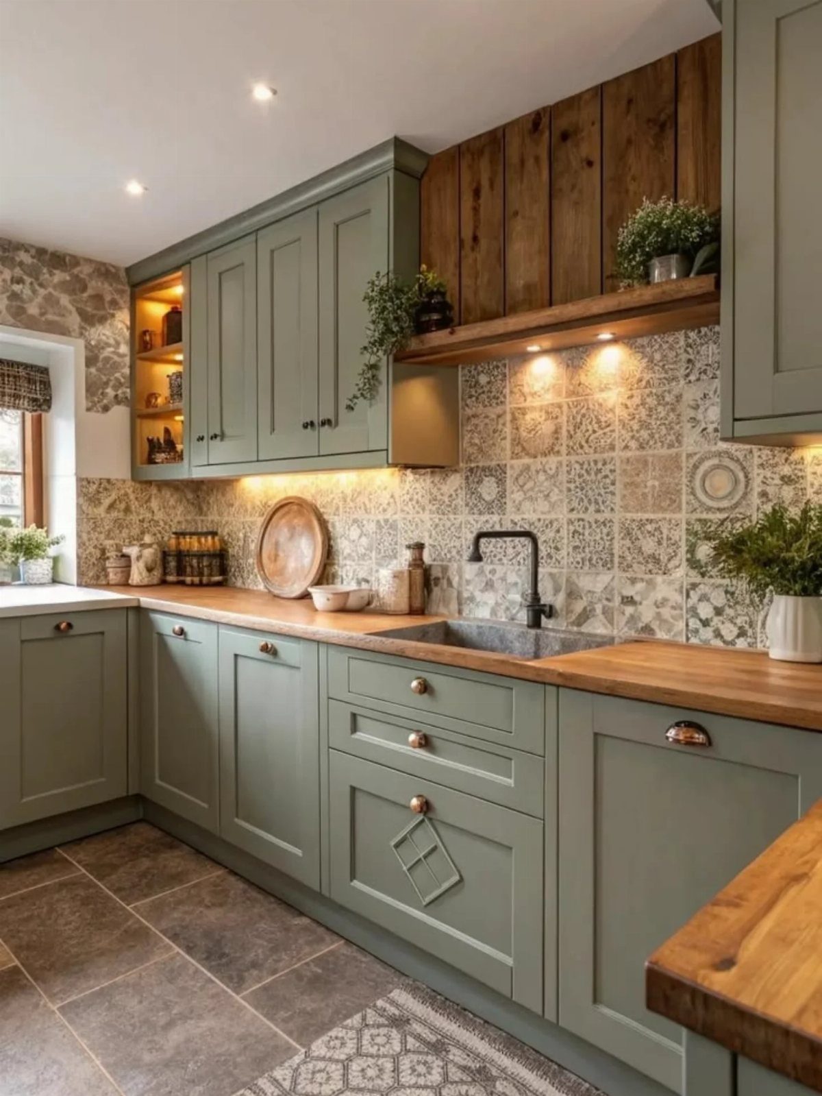
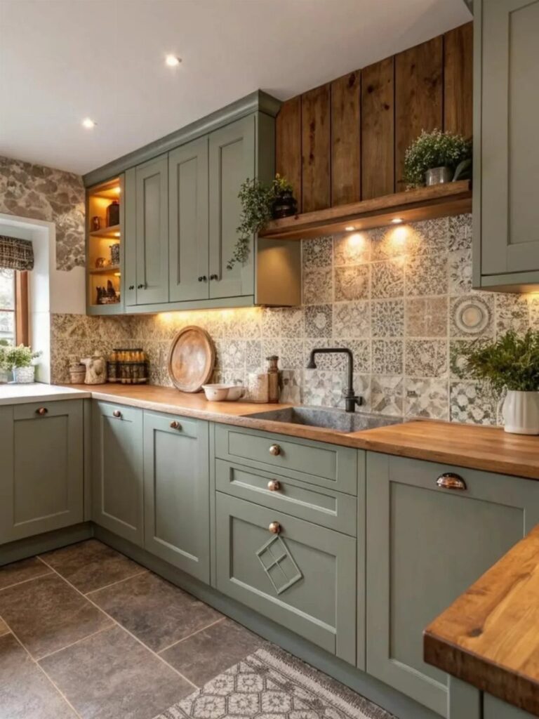
Sage green reads as a color because it carries enough gray to sit back, which is why it pairs well with busy natural wood grain without fighting for attention.
For a rental, peel-and-stick sage vinyl on existing cabinets comes off clean; if you own, a quart of cabinet-grade paint covers a full small kitchen and costs less than a takeout dinner for two.
I would keep the wood to countertops or a hood shelf, not both, and let the tile do any pattern work.
2. Butter Yellow Cabinet Color
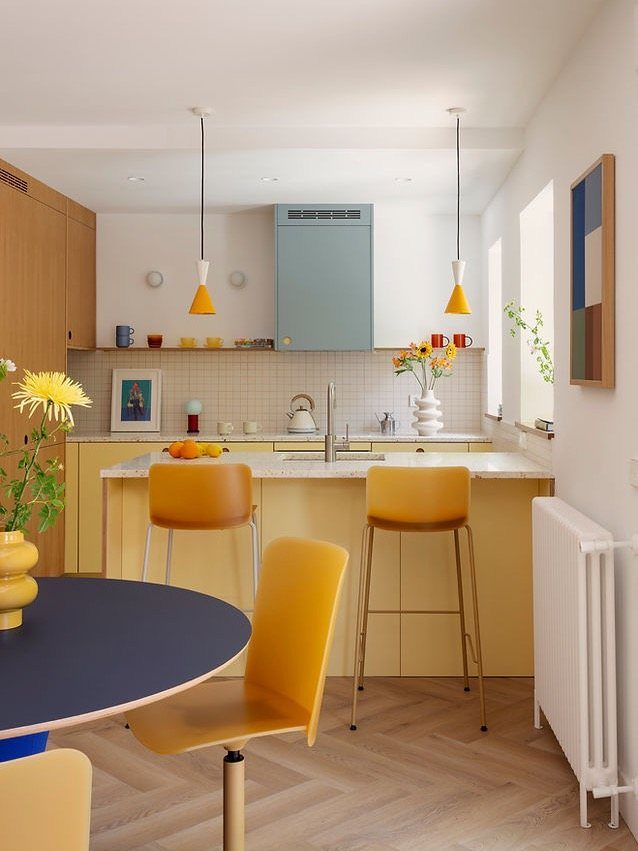
A butter yellow kitchen risks nursery unless you pair it with a contrasting color like a light blue hood, and ground everything with wood tone.
The barstools matching the cabinets is a choice I find excessive; I would have gone natural or white.
If you are renting, yellow on a single island or base cabinet section lets you test the mood without committing the whole room. 2 coats of cabinet paint over primer handles it on a weekend.
3. Emerald Green Cabinet Color
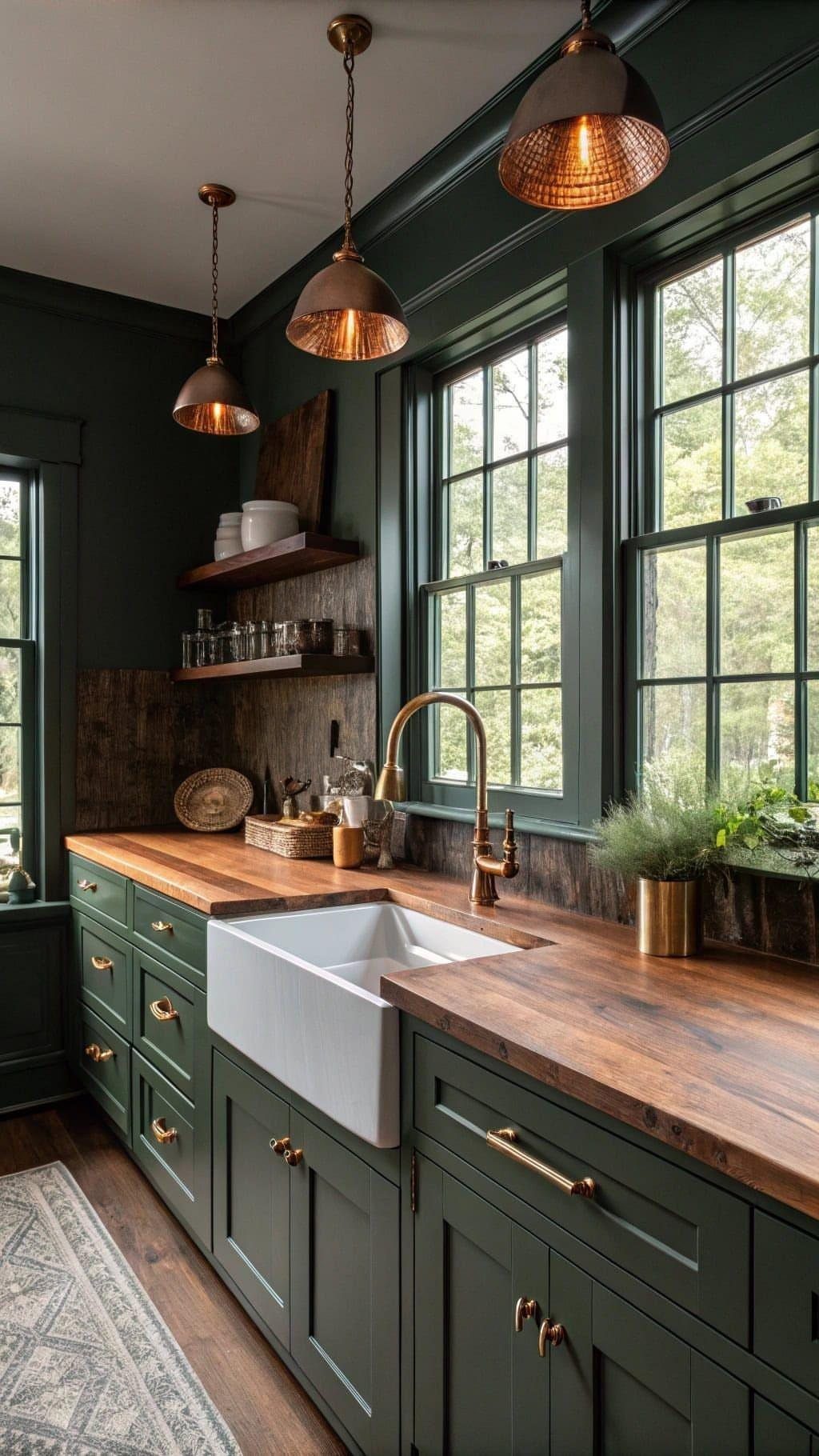
Emerald green needs brass or copper nearby; chrome or nickel would flatten it to something more ordinary.
The butcher block here does 2 jobs: it warms the green and it keeps the cost well below stone, which runs higher and colder.
If your kitchen lacks the window light this one has, I would go one shade lighter on the green or add under-cabinet LEDs, since dark cabinets in a dim room read as black by late afternoon.
4. Black Island with White Cabinetry
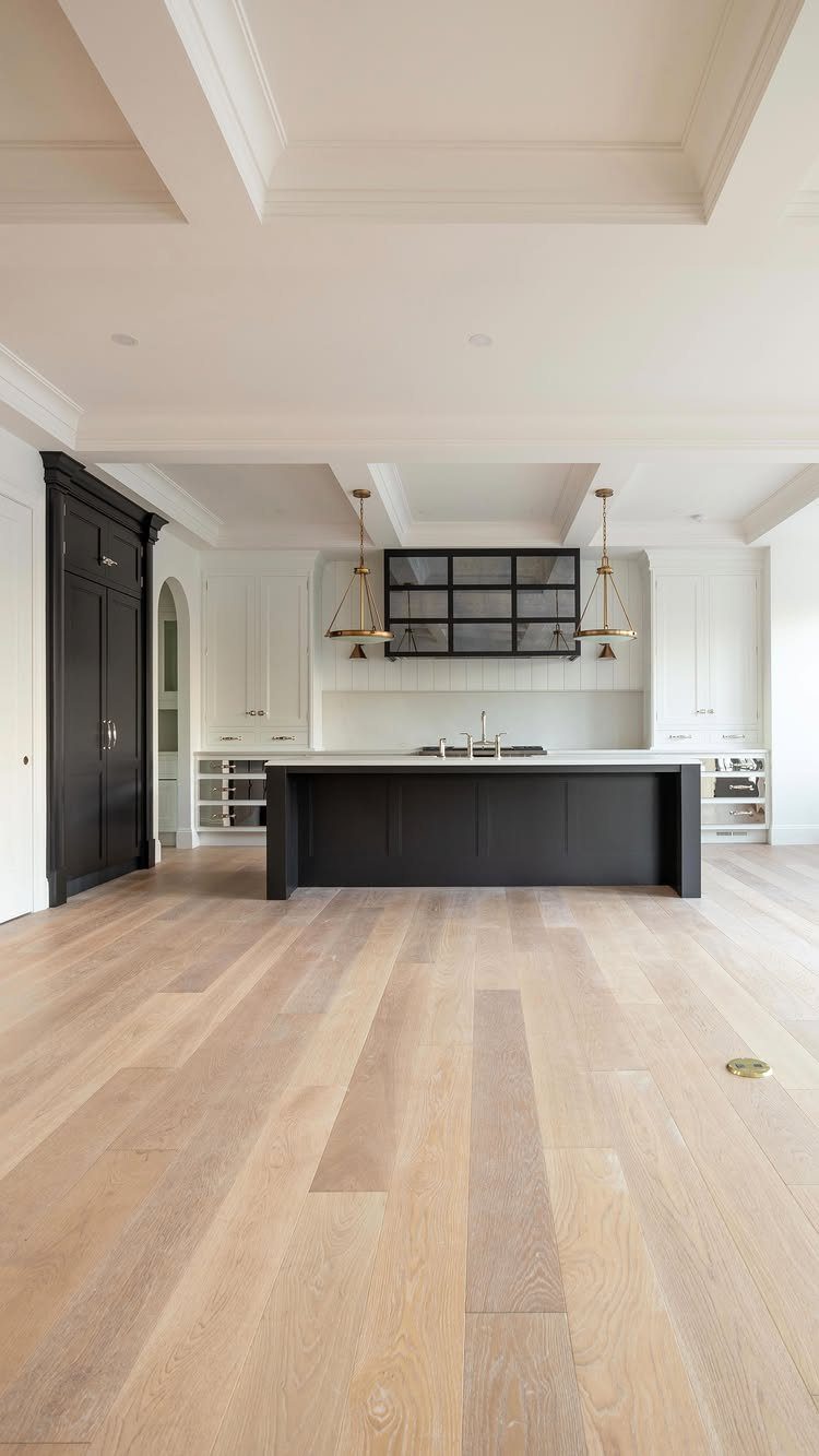
The black island against white cabinetry is the safest bold move on this list; it defines the kitchen’s center without asking the perimeter cabinets to commit.
Matte black paint on an island hides fingerprints better than satin, which matters on a surface that takes daily use. I prefer the brass pendants here to chrome, the warmth keeps the black from reading as appliance-like.
If your floors are dark already, a black island can feel heavy; then I would add a light countertop, as this example does, rather than matching dark-on-dark.
5. Warm Beige Cabinetry
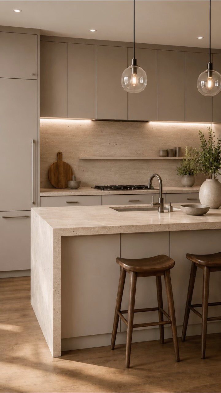
Warm beige works when it leans muddy rather than pink; against white walls and old beams, the tone adds age that pure white would strip away.
This kitchen chose stone and wood as its 2 main materials first, then let hardware and lighting follow, a discipline I use myself.
Waterfall islands eat material and labor; a standard overhang on 3 sides keeps stone costs down and looks nearly as current. Under-cabinet lighting is not decorative here, it is what keeps beige cabinets from appearing gloomy after dusk.
6. Deep Red Kitchen Colors
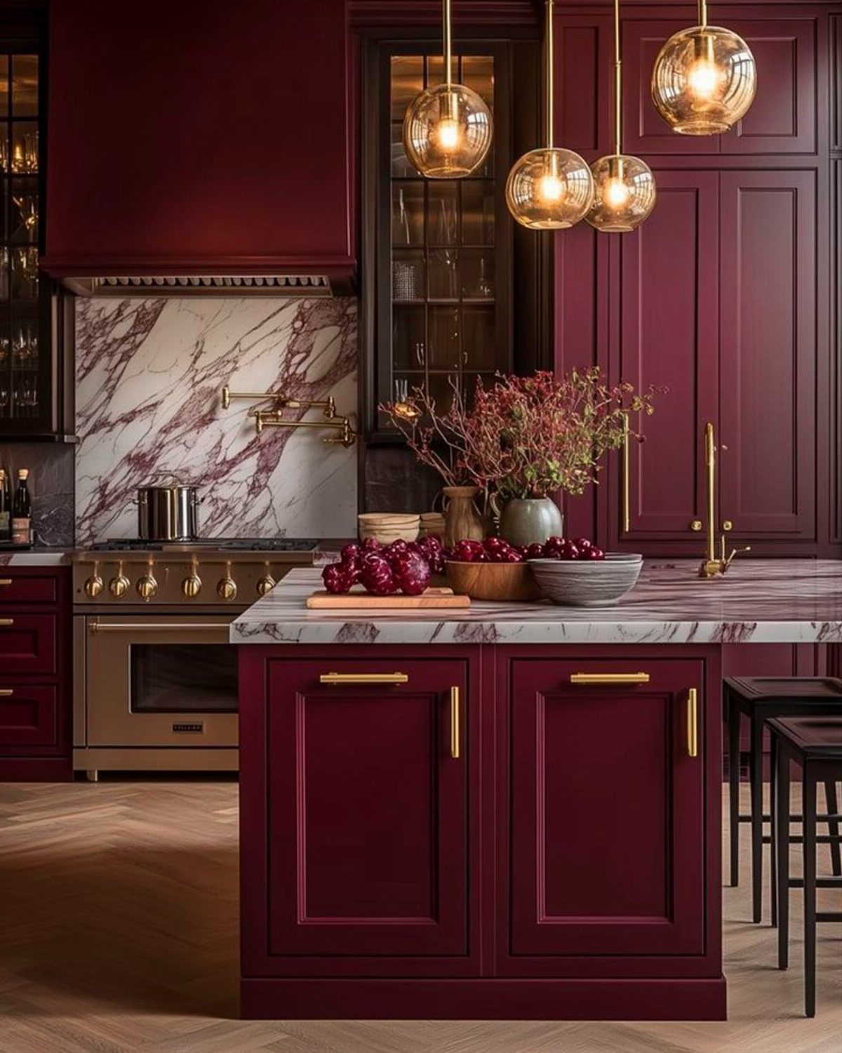
Deep burgundy is the most demanding color on this list; it needs gold hardware and warm light to read rich rather than institutional.
The purple veining in the marble here is doing deliberate work, tying the red to a cooler accent so the whole scheme does not flatten to one temperature.
I would not attempt this in a small galley kitchen, the color closes walls in, but in a spacious room with height, it adds a formality that white or wood cannot touch.
Satin-finish paint on cabinets keeps the red from looking like lacquer; 2 coats minimum, and tinted primer is not optional with a saturated base.
7. Navy Blue Cabinet Color
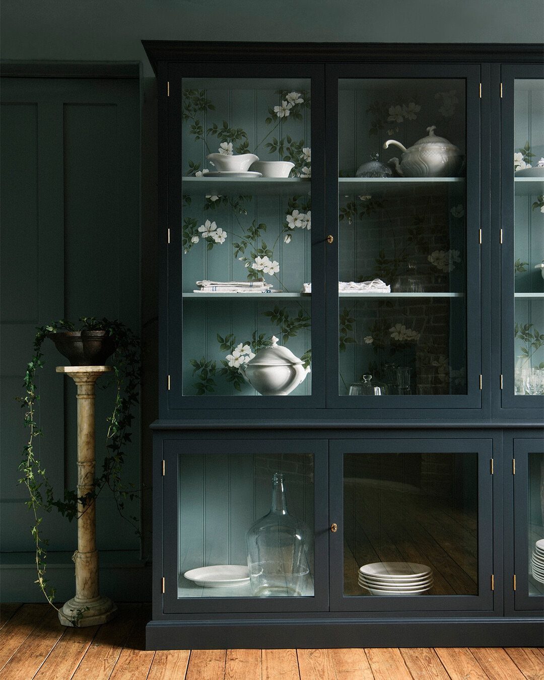
Navy blue in a glass-front cabinet reads as storage furniture pulled into the kitchen, not a built-in trying too hard.
Solid navy flattens to office-like without something to break it up; pattern behind the glass keeps it from looking like a bank lobby.
I would use navy only where cabinet doors are present, keeping open shelving or walls light to keep depth.
If you are renting, removable wallpaper behind existing glass panels changes the whole mood with no paint and no permanent change.
For owners, navy eggshell over sanded primer covers in 2 coats and forgives the surface irregularities that high-gloss cruelly reveals. Brass or unlacquered bronze hardware is almost obligatory; chrome would read cold against this blue.
8. Classic Wood Tones Kitchen
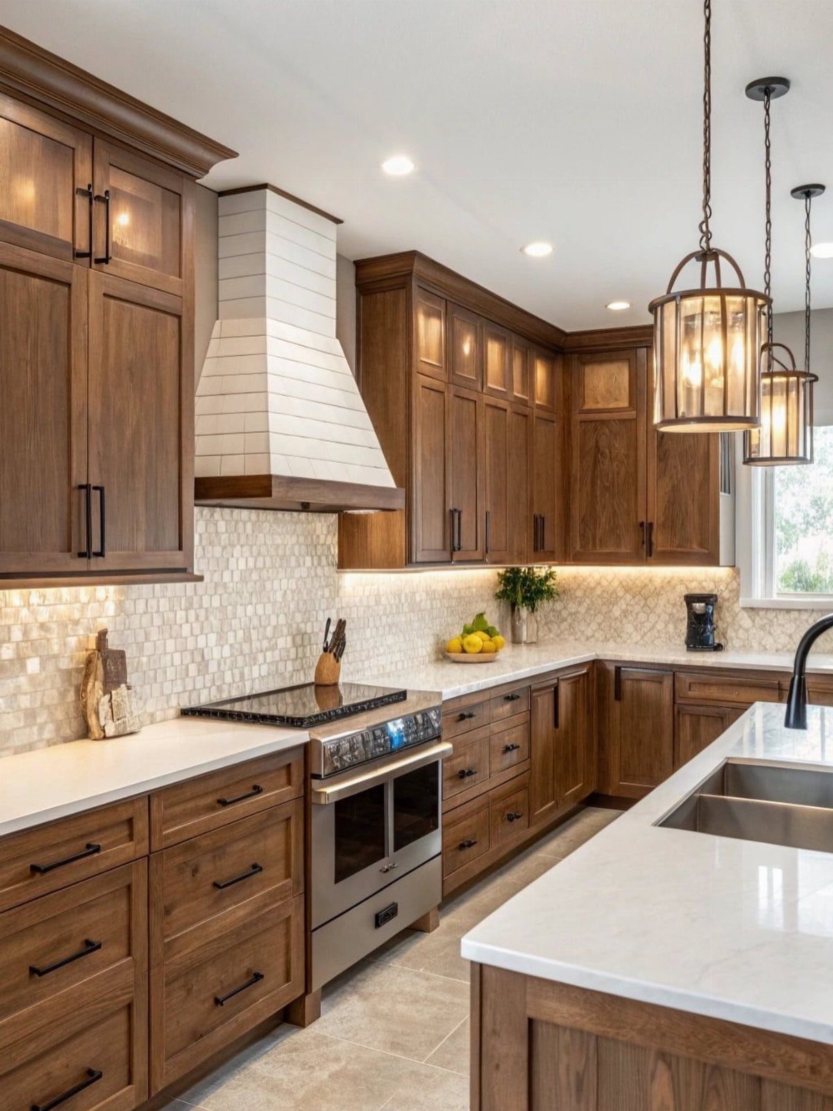
Rich wood cabinets survive trends precisely because they ignore them, and in a room you update piecemeal over years, that neutrality pays.
Mosaic backsplash tile here adds rhythm without competing; I would keep grout medium-toned, since bright white fights wood warmth and dark grout turns busy fast.
The lantern pendants are a specific choice I would copy: their black metal lines echo the stove without matching it exactly. Wood cabinets take oil-finished butcher block or quartz equally well, so let your countertop budget decide.
If your existing cabinets are solid wood in rough shape, refinishing beats replacement on cost and waste both; a palm sander and 2 coats of water-based polyurethane handles a small kitchen in a long weekend.
9. Dusty Rose
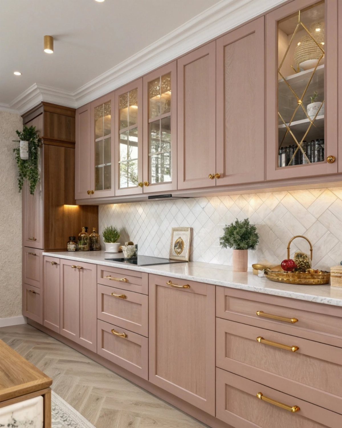
Dusty rose carries enough gray to avoid the nursery association that terrifies most adults considering pink, and the gold handles confirm its intent: grown-up, deliberate, slightly French.
Herringbone floor and backsplash both running the same pattern risks dizziness; in my own space I would choose one or soften the other to straight lay.
This tone needs bright rooms. In a kitchen with a single window, dusty rose turns muddy by afternoon, so I would test a swatch on the north face and check it late in the day before committing.
2 coats over tinted primer, and I would keep countertops light; dark stone against this pink reads antique shop in ways that do not flatter.
10. Electric Purple Cabinet Color
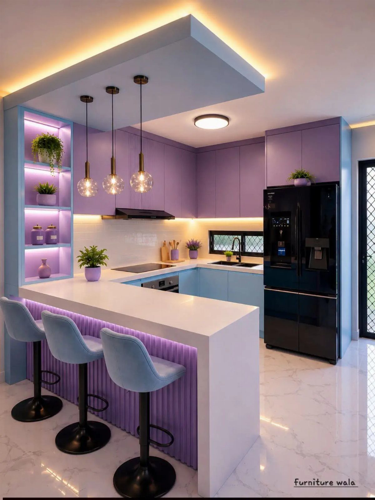
Electric purple demands a partner color to ground it, and the light blue lower cabinets here provide exactly that cool balance; all-purple would read as stage set.
The fluted paneling on the breakfast bar adds texture that the flat cabinet faces need, since saturated color on a flat plane can look like plastic.
I would reserve this pairing for upper cabinets only; full coverage pulls walls inward visually and standard-height rooms feel it worst.
For renters, purple contact paper on upper cabinet interiors only, visible when opened, is a zero-commitment nod to the idea. Paint requires tinted primer and likely 3 coats; pigment this heavy covers poorly and shows streaks mercilessly.
11. Multicolor Accents
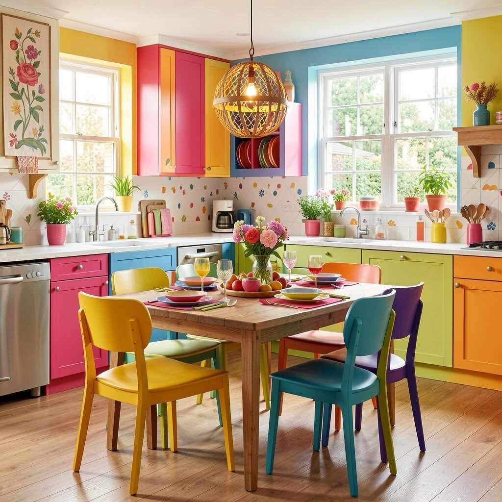
A multicolor kitchen lives or dies on restraint somewhere, and here the restraint is the single wood table and the plain white ceiling that keeps the yellow and blue walls from overwhelming the space.
Without that anchor, this reads as playroom. I would choose one color family if I were nervous: warm tones, say, leaving cool ones out, rather than spreading across the whole wheel.
Painting existing cabinets in place takes roughly one weekend per color, with proper dry time between coats, so this is not a single-weekend project despite the budget being modest per cabinet.
For renters, colored adhesive vinyl on lower cabinets only, kept to 2 tones, tests the idea without the labor of full commitment.
The chairs matching cabinet colors is a choice; I would rather one neutral wood tone at the table to let the cabinets do the work alone.
Creative Tonic’s Courtnay Tartt Elias went bright and cheerful with Sherwin-Williams Spearmint (SW 6465) in this kitchen. “Remodeled for a young single father and his two boys, this light-filled kitchen was the perfect place to channel joy,” the Houston-based designer says of the pastel wonder.
Choosing the Right Color
The atmosphere you want in your kitchen should connect to whatever room sits next to it.
Glidden’s range runs wide enough that you can hold 2 swatches side by side in the actual light both rooms get, which is the only test I trust.
If your kitchen opens to a hallway you do not control, as in many rentals, keep the kitchen color more restrained; let the brighter move live on a cart or the inside of a cabinet you can close.
Balancing Colors
Contrasting colors work best when they have a job beyond simply being different. I would stop at three colors total, and treat wood tone as one of them; four starts to look like a collection rather than a plan.
If your lower cabinets are one color and uppers another, the island is where I would introduce the third, not a fourth.
In a small kitchen, 2 colors is enough; the contrast should add depth, not complexity you cannot afford in square footage.
Timeless Vs. Trendy
A color that reads stylish in an old catalog may already carry the timestamp a few years later; the "millennial gray" wave is the example I see most often in kitchens that now feel tired, not timeless.
Classic wood tones and navy that reads as furniture age better because they borrow from rooms outside the current trend cycle; deep burgundy and electric purple are bolder bets that I would keep to surfaces easiest to repaint.
The distinction I use: if a color needs a specific matching appliance finish or hardware style to work, it is borrowing against future compatibility.
Satin and eggshell sheens also read as enduring where high-gloss trends toward period drama; if you tire of the color, the sheen at least will not date it.
I would spend the longer timeline on a test, living with a swatch for the weeks a cabinet repaint actually takes, before committing a whole kitchen to anything outside off-white or wood.
Frequently Asked Questions
What is a good color for a dark kitchen?
If the kitchen has no window or gets little direct sun, I would pick a color one step lighter than the sample, or line the underside of cabinets with LED strip lights.
Cabinetry that already reads dark will turn to solid black once the daylight drops; emerald green flattens out and navy becomes one flat shadow.
Warm lightbulbs and reflective surfaces help, but the real fix is lifting the color itself or adding artificial light where the sun does not reach.
What are the most fashionable kitchen colors?
Emerald green, deep burgundy, navy blue, and electric purple are the bold directions I see most often now, with butter yellow and sage green running quieter but current.
Classic wood tones and warm beige sit outside the trend cycle; they age better because they neverread as specifically of-the-moment. The risk with fashionable colors is that millennial gray looked cutting edge until it did not.
Which 3 color combination is best?
I would count wood tone as one of the three and stop there; a fourth color starts to look gathered rather than chosen.
The most reliable formula is a main cabinet color, a contrasting secondary color on an island or lowers, and wood or white as the third grounding element.
A small kitchen only needs 2 colors to gain depth; extra contrast becomes clutter the room does not have room for.