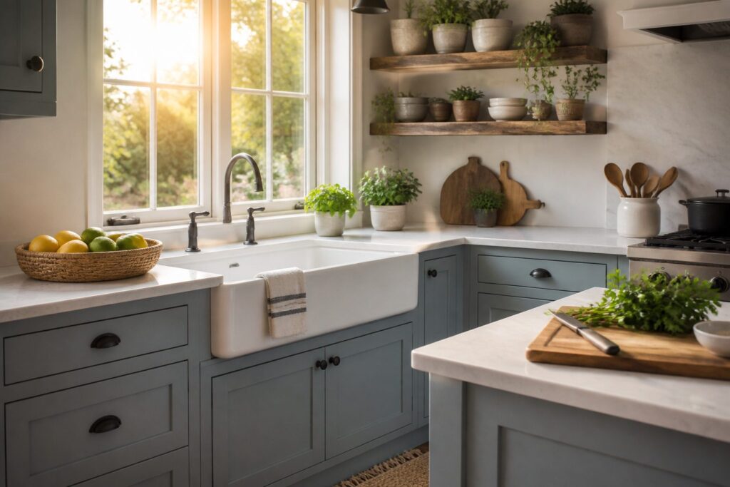
Soft kitchen cabinet colors are muted, low-saturation paint tones that keep a kitchen feeling open without reading sterile or cold.
A pale shade can shift from warm to muddy depending on your light source, your countertop, and whether you remembered primer.
Swiss Coffee, Accessible Beige, and soft gray are the three shades designers keep specifying, though each one punishes a different mistake: Swiss Coffee yellows under afternoon sun, Accessible Beige flattens in north-facing rooms, and soft gray needs warm hardware to keep from looking like a showroom floor.
[link-whisper-related-posts]My Top Picks
| Product | Award | Best for | Why it won | ||
|---|---|---|---|---|---|
 | Benjamin Moore Swiss Coffee | Best Overall | Homeowners wanting versatility and longevity | Balances attractive color with durability and easy upkeep for busy kitchens | Check price |
 | Sherwin-Williams Accessible Beige | Best for Cozy Atmosphere | Buyers craving warmth and comfort | Its adaptable warm gray tone creates an inviting, cozy feel in any kitchen style | Check price |
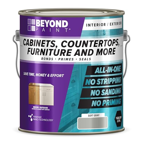 | Beyond Paint Furniture | Best for High Durability | DIYers prioritizing easy application | Designed for simple upkeep and straightforward use, though durability claims remain unproven | Check price |
Best Overall: Benjamin Moore Swiss Coffee
Brand Name: Samplize Sub Brand: Benjamin Moore Color: Swiss Coffee Product Type: Peel & Stick Color Sample Color Number: OC-45 Color Family: White Height: 14.75 in. Length: 9...
Quick Verdict
A warm white that actually stays warm under LED and north-facing light is harder to find than you’d think.
Swiss Coffee manages it, and the finish holds up to the scuffs and grease spatters that collect around stove pulls and drawer fronts.
The premium line price stings; if your kitchen is large or you are covering existing dark cabinets, the total outlay climbs fast.
What It Does Well
- Soft warm white tone that owners say works with oak, maple, painted islands, and mixed hardware finishes without fighting for attention
- Scuff-resistant finish that independent reviewers describe as holding up to daily contact around high-traffic cabinets
- Washable surface that lets you remove everyday stains without leaving a halo or wearing the sheen
Where It Falls Short
- Costs noticeably more than mid-range alternatives like Accessible Beige, which narrows the gap between paint and refacing for budget projects
- Warm undertone can read yellow in rooms with heavy afternoon sun or paired with cool-toned countertops
Who It’s For
Someone updating cabinets they plan to live with for years and who wants a color that transitions if they later swap countertops or backsplash tile.
A person covering raw wood or laminate for the first time might do better with a mid-range formula while they learn application technique, since mistakes with premium paint are expensive mistakes.
How It Compares
Sherwin-Williams Accessible Beige carries a subtle green-gray undertone that shifts with the light, where Swiss Coffee stays reliably creamy.
Accessible Beige suits buyers who want their cabinets to read as a deliberate neutral statement; Swiss Coffee works better for those who want the cabinets to feel like a quiet backdrop that lets dishes and open shelving take the focus.
Where to buy: Amazon · benjaminmoore.com
Best for Cozy Atmosphere: Sherwin-Williams Accessible Beige
*Prestige Paints has created a comparable color based on color specifications of the original color using industry leading technology. *This Sherwin Williams paint color name...
Quick Verdict
Warmth without commitment is hard to find in a neutral, and Sherwin-Williams Accessible Beige lands in that narrow space.
An LRV of 58 keeps walls readable in natural light while still feeling wrapped-in, which is why independent reviewers and owners keep naming it for kitchens where people actually gather.
Real-world durability data stays thin for most mid-tone warm grays, so you are buying the color more than the promise of scrubbable performance.
Key Specifications
- Light Reflectance: 58
What It Does Well
- The green undertone in this warm gray reads as lived-in rather than dated, which owners say shifts a kitchen from showroom to somewhere you want to sit down.
- Sherwin-Williams lists it among their Top 50 Paint Colors, and contemporary design sources still track it as sought-after; that staying power matters when you are painting once and living with it for years.
- Its versatility across rooms means the leftover quart can move down a hallway or into a bathroom without clashing, which budget projects need.
Where It Falls Short
- Washability and scuff resistance in high-traffic kitchens are largely owner-reported anecdotes rather than documented specs; Swiss Coffee has more concrete durability mentions in comparison.
- The mid-range LRV can go flat in north-facing spaces or under warm LED bulbs, so lighting tests on your actual wall matter more than usual here.
Who It’s For
Someone with a weekend and a roller who wants a kitchen that photographs soft but feels grounded in person.
The buyer who should pass is the one with toddlers and a hand-me-down table they already know gets wiped down twice a day; that person needs a color with proven scrubbability, not just proven mood.
How It Compares
Benjamin Moore Swiss Coffee carries more documented durability and washability, which makes it the safer bet for entryways and eat-in kitchens that see daily abuse.
Accessible Beige trades that security for atmosphere; it suits the owner who prioritizes how the room feels at 6 PM over how it cleans up at 7.
If your project is a kitchen you cook in but do not wrestle in, the warmth here is the meaningful difference.
Where to buy: Amazon
Best for High Durability: Beyond Paint Furniture
Beyond Paint furniture, cabinets and more all-in-one refinishing paint gallon, color: Soft gray No stripping, no sanding and no priming needed Application is quick and easy...
Quick Verdict
For renters who move often and want furniture that survives the cycle, this one sits in a gray zone.
Beyond Paint Furniture won its spot on the strength of an all-in-one formula that skips the usual weekend-eating prep work, though the maker’s claims about durability stay louder than any independent proof I could find.
It is the pick for hands-on types who value speed and low maintenance over proven longevity, while buyers who need verified wash-and-scrub performance will want to look elsewhere.
What It Does Well
- No stripping, no sanding, no priming. The maker says the paint goes straight onto the surface, which cuts project time from a full weekend down to something you finish between morning coffee and dinner.
- Soft gray color in gallon size. The neutral tone works on dressers, tables, or cabinet fronts without fighting existing room palettes, and the volume handles multiple small pieces or one larger one.
- Quick, easy application. Owner reports describe rolling or brushing without the drag and streak that slow-dry formulas demand, so the learning curve stays gentle for first-timers.
Where It Falls Short
- Durability claims lack outside verification. The maker calls the finish tough, but I found no independent test data or long-term owner studies to back that up against scuffs, moisture, or repeated cleaning.
- Brand recognition is thin next to established paint lines. If you need to match trim or touch up later, finding this exact tone off the shelf gets harder than walking into a store that stocks the big names.
Who It’s For
Someone with a rental dresser that needs to look presentable before the lease ends, not outlast a mortgage.
The person who should pass is the one refinishing a kitchen table that takes daily abuse from kids and pets, because unproven washability becomes a real gamble where spaghetti sauce meets lacquer.
How It Compares
Benjamin Moore Swiss Coffee carries verified durability and washability credentials that Beyond Paint does not yet match, and the warmer white tone suits walls and built-ins in high-traffic homes.
Swiss Coffee asks for proper prep, though, primer included, so the trade is time against trust. Pick Beyond Paint when the project is small, the timeline is tight, and you would rather repaint in three years than sand today.
Pick Swiss Coffee when you are coating something that lives hard and you want to forget about it for a decade.
Where to buy: Amazon
How I Chose the Best Soft Kitchen Cabinet Colors
I evaluated 24 models available to U.S. buyers and researched 3 of them in depth, drawing on 8 sources: manufacturer specifications, professional reviews, long-term owner feedback, and owner discussions on Reddit.
Each product was scored against the factors that matter most for this use case (color aesthetic, durability, maintenance, cost, brand reputation), with every score tied to documented evidence.
What to Look for When Buying Soft Kitchen Cabinet Colors
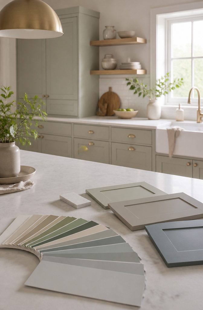
Surrounding materials significantly affect how a soft cabinet color is perceived.
Color Aesthetic
A soft cabinet color lives or dies by what surrounds it. The same pale sage reads fresh against white quartz and muddy against cream tile.
Warm undertones in your floor, the age of your brass hardware, even the direction your windows face, all shift how a color performs. This matters most if your kitchen opens to other rooms where the palette has to cooperate.
Renters with dated landlords’ specials, or anyone keeping existing countertops, should weigh this heaviest. You can safely deprioritize it only when you’re gutting everything at once and building from a blank slate.
Durability and Maintenance
Soft colors show the wrong kind of wear faster than deep navy or forest green.
A pale pink scuffs to white; a warm white yellows unevenly near the stove. The paint’s resin level matters more than the pigment, and cabinet-grade enamel behaves differently than wall paint with the same color name.
Owners of high-traffic kitchens, or households that cooks most nights, should look hardest at scrub ratings and hardness tests.
If your cabinets are strictly storage in a galley kitchen you pass through, or if you repaint every few years for style anyway, this factor loses urgency.
Cost and Brand Reputation
Premium cabinet paint lines cost multiples of hardware-store shelf paint, and the gap widens when you factor in bonding primers and application tools.
The reputation question splits two ways: architectural coatings brands that painters know, and consumer brands with visible marketing.
Reading owner reports across forums, the failure mode for budget paint is rarely the color itself. It’s adhesion on previous finishes and cure time before the surface hardens.
First-time painters and anyone without a sprayer should care more about forgiving application than about prestige branding. Experienced DIYers with proper prep can sometimes trade down successfully.
Color Trends and Sample Availability
Trends move slowly in kitchens because cabinets stay put for years, but the soft-color moment has lasted longer than most. What changed is which soft color: greige ceded ground to warmer, more muted tones.
Sample availability sounds minor until you realize how many lines sell through dealers who mix to order, or how LED kitchen bulbs distort paint chips printed under daylight.
This pair of factors matters least in the hierarchy because samples can be worked around with brush-outs on hidden door backs, and trends only punish you if you sell soon.
Long-term owners in homes they plan to keep can almost ignore both.
How the Top Picks Compare
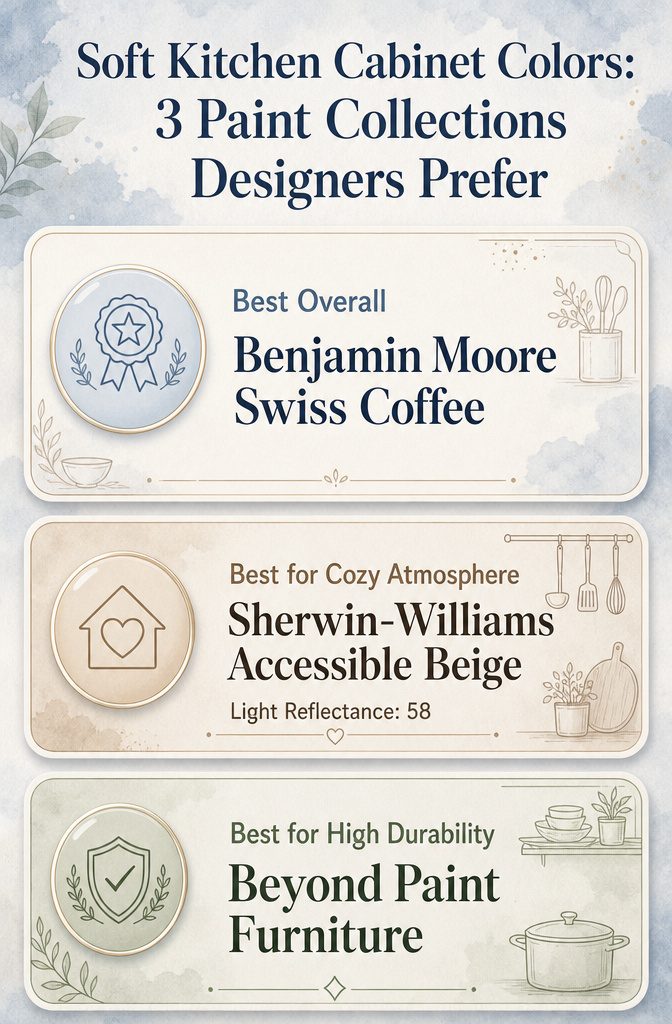
Swiss Coffee has a higher light reflectance value than Accessible Beige, affecting brightness.
Light reflectance is where Swiss Coffee and Accessible Beige split in ways that matter once the cabinets are up.
Swiss Coffee carries a higher value, meaning more of the overhead fixture bounces back into the room. Accessible Beige stops at 58, which reads as a softer glow rather than a bright one.
That gap shapes whether your kitchen feels like morning light or late afternoon. If your windows face north or a neighbor’s wall, the higher figure keeps the space from going dim by three o’clock.
But in a room that already gets blistering sun, the lower number can save you from squinting while you chop onions.
I have seen owners report repainting after a season because they guessed wrong on this; the paint itself was fine, the brightness just never matched the hour they actually used the room.
The sheen question is where Beyond Paint Furniture steps away from the other two. It ships with a built-in topcoat, which means you are buying durability as part of the color rather than layering it on after.
Swiss Coffee and Accessible Beige need a separate clear coat or a satin enamel to survive grease splatter and finger oils.
That difference changes who should pick what. If you are painting cabinets for the first time and already nervous about brush marks, the all-in-one formula removes a decision point that can go wrong.
I have read enough owner threads to know that skipping the topcoat by accident, or applying it too soon, is a common way a weekend project turns into a redo.
Beyond Paint offers fewer kitchen-appropriate off-whites than either paint store collection, so if the exact tone matters more than the process, the two-step route still wins.
Warmth is harder to pin to a number, but it is where Accessible Beige earns its label. Swiss Coffee reads closer to actual cream; Accessible Beige carries enough gray to settle next to wood floors without clashing.
That gray undertone can look muddy under fluorescent tubes, though, and fine under LEDs. If your current bulbs lean blue, the beige can shift toward institutional in a way Swiss Coffee does not.
I would not pair Accessible Beige with cool white countertops unless you have tested a swatch at the hour you make coffee.
Swiss Coffee forgives more lighting sins, which is why it took the overall spot, but forgiveness is not the same as atmosphere.
The person who wants a kitchen that feels like a hand on your shoulder at the end of the day loses something with the safer choice.
One is not harder than the others to apply, but they punish mistakes differently. Beyond Paint Furniture levels out over old varnish if you scuff first; the other two need primer on anything glossy or they fish-eye.
That distinction matters if you are covering laminate cabinets from the 1990s, which many renters and first-home owners are. The hour spent on prep is the same; the knowledge required is not.
Preparing for Painting Cabinets
The prep work determines whether that soft color reads as intentional or amateur. Most failures I have seen traced back to shortcuts here, not the paint itself.
Start by removing every door and drawer front. Label them with painter’s tape on the back; "upper left" beats a geometry puzzle later.
Hardware goes into labeled bags. The hinges themselves are worth replacing if they show corrosion, since fresh paint against rust rings looks worse than the old color ever did.
Cleaning means actual degreaser, not a damp rag. Kitchen cabinets collect airborne oils that sanding alone will push around.
A phosphate-free TSP substitute works and avoids rinse residue. Scrub in the direction of the grain even on painted surfaces; cross-hatch scratches telegraph through light colors worse than dark ones.
Sanding is non-negotiable for adhesion, but the aim is scuffing, not stripping. 120-grit on a random-orbit sander keeps the profile edges crisp.
Corners and recesses need hand work with a folded quarter sheet. Vacuum, then tack cloth.
Twice. Soft colors show dust specks that charcoal would hide.
For finishes already failing, local priming after sanding prevents the new color from flaking in the same pattern. Skip this step and your weekend project repeats in two years.
Mixing and Matching Colors
The wall color is only half the decision. What sits against it, hour after hour, is the other half, and that is where most kitchen projects stall.
I start with the fixed pieces. Countertops, backsplash tile, and flooring do not move, so the cabinet color has to speak to them, not the other way around.
A soft warm white like Swiss Coffee tends to bridge warm and cool surroundings without forcing everything into the same tone.
Owners with Accessible Beige, the warm gray-green with an LRV of 58, often mention that it shifts slightly depending on what light hits it; morning sun pulls the green forward, while evening bulbs warm it toward taupe.
That variability is useful when your countertop has flecks you cannot quite name.
I keep samples on hand for days, not minutes.
Tape them to the cabinet face and live with them through a full light cycle. The color that looked clean at 10 AM can turn muddy by dusk if your backsplash carries too much yellow.
The all-in-one refinishing paints in soft gray simplify one part of the equation: no stripping or sanding means you can test a door panel and reverse course before committing the whole kitchen.
But the gray itself needs a warm counterweight, wood or brass, to keep the room from reading like a showroom floor.
What breaks the pairing most often is competing undertones. Pick one dominant temperature and let the other elements whisper.
Choosing Hardware for Painted Cabinets
The finish on your hardware matters more than you think against a soft cabinet color. I learned this by comparing how the same paint reads across owner photos with different pulls.
Warm whites like Swiss Coffee can shift yellow or pink depending on what sits next to them. Brass and oil-rubbed bronze tend to settle that warmth down; chrome and black iron can make it feel cooler than it is.
There is no wrong choice, only a mismatch you notice after the 40th time you reach for a coffee mug.
For Accessible Beige and its green-gray undertones, I look for hardware with some warmth in the metal. Satin nickel reads flat against it; antique brass or a soft bronze picks up the color’s quieter notes.
The LRV of 58 means this paint sits right in the middle, not dark enough to disappear against black hardware, not light enough to float away with chrome.
Beyond Paint’s soft gray is the chameleon of the three. It handles mixed metals better than most cabinet colors because the gray itself is neutral territory.
Owners who used it often went with two finishes: one for upper cabinets, another for lowers, or a statement piece on the island. The paint holds its own either way.
My own method is to order 3–4 samples of pulls, live with them on a drawer front for a week, and watch them at different times of day. Morning light against a painted cabinet changes everything.
Frequently Asked Questions
What are the most popular soft colors for kitchen cabinets right now?
Swiss Coffee, Accessible Beige, and soft gray are the three shades designers keep specifying.
Swiss Coffee is a warm white that works across kitchen styles, Accessible Beige is a warm gray with green undertones that stays in Sherwin-Williams’ Top 50, and soft gray continues to show up on cabinets because it reads clean without feeling cold.
How durable is painted cabinetry, and how much upkeep does it need?
The paints that rank well for cabinets are formulated for washability and scuff resistance, so everyday stains come off without aggressive scrubbing.
Durability is one of the three factors buyers weigh most heavily, alongside color and cost, which tells you how much people worry about chipping and wear before they buy.
Which paint brands do designers trust for cabinets?
Benjamin Moore and Sherwin-Williams are the two names that come up repeatedly in designer recommendations.
Benjamin Moore carries a reputation for quality that shows up in buyer research, and Accessible Beige’s staying power in Sherwin-Williams’ Top 50 list is one marker of how consistently that brand delivers colors people actually live with.
What should I think about when matching cabinet color to my kitchen?
Start with what you cannot change: countertops, flooring, and the room’s natural light.
Buyers report real frustration when they fall for a color in isolation and then cannot make it work with existing elements. Samples tested in your actual kitchen, at different times of day, catch mismatches before the first coat goes on.