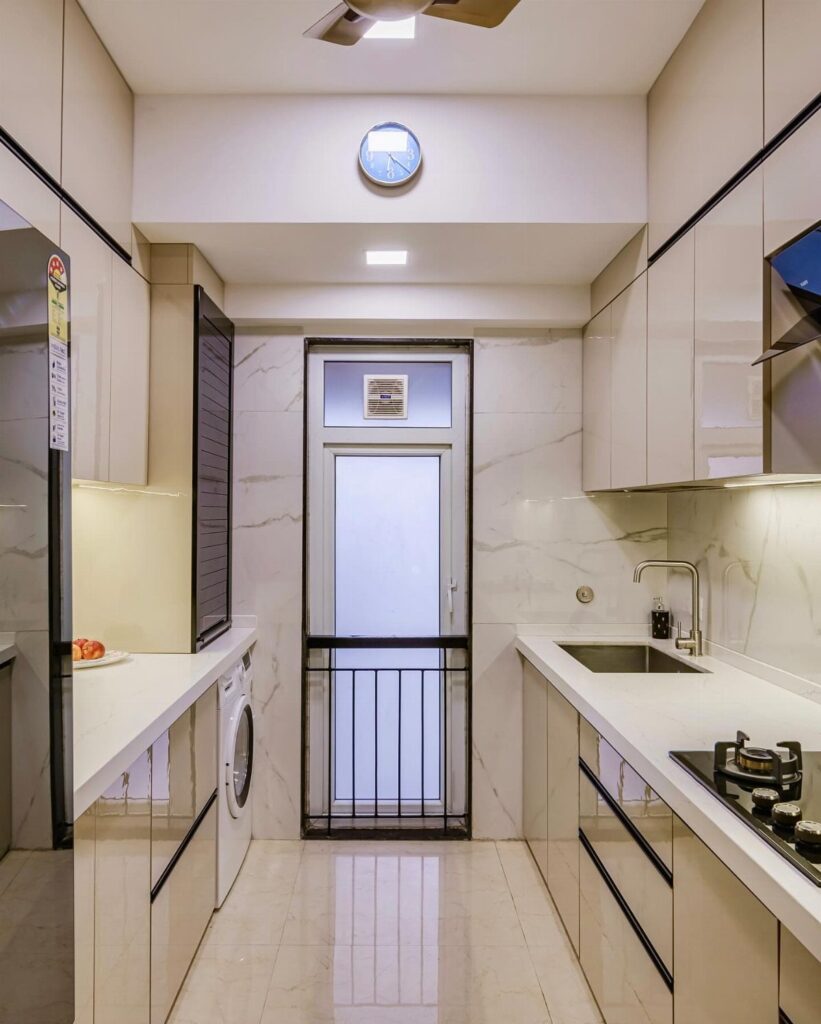
These layouts run from a straight-line setup for studios to a full U-shaped build, with budgets that scale from repainting stock boxes to integrated appliances with unbranded panels.
The layout that works comes down to one measurement: your aisle width in a parallel kitchen, your corner depth in an L shape, or whether your wiring already runs to the center of the room for an island kitchen.
[link-whisper-related-posts]1. L-Shaped Kitchen
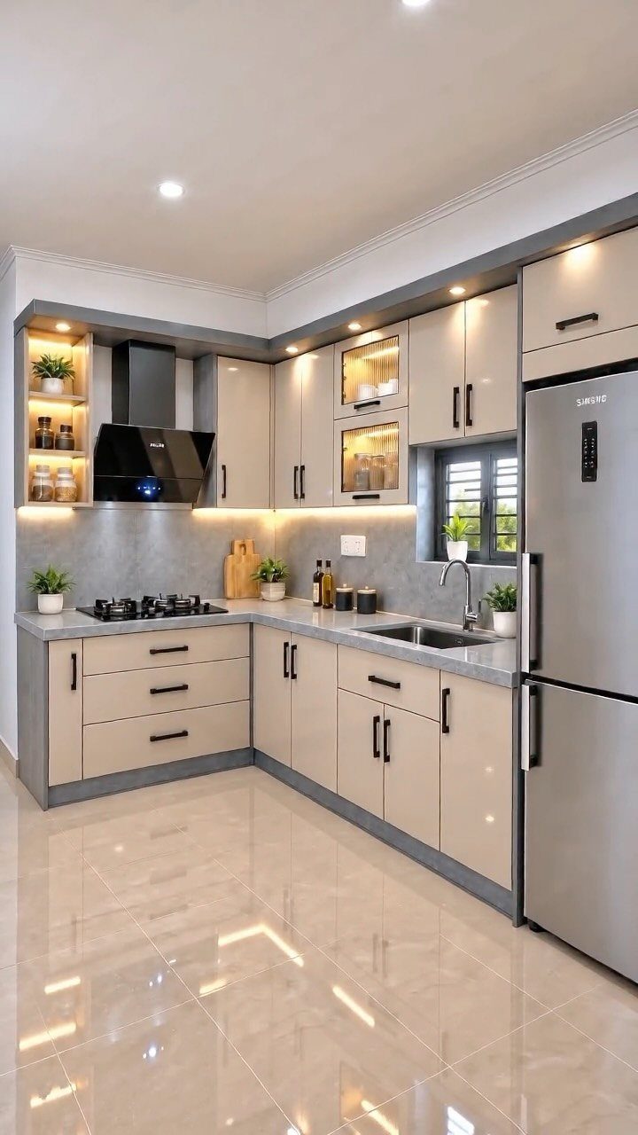
An L shape wraps 2 walls of cabinets around a corner, which is exactly where most kitchens waste space. Base cabinets on both legs, uppers where they fit, and the corner itself becomes storage depth rather than a dead zone.
This is the layout that lets you phase the work: one leg now, the other when the budget recycles.
Measure your corner carefully; a blind corner cabinet with a pull-out shelf costs more than a standard base but uses the space you otherwise lose.
2. Island Kitchen
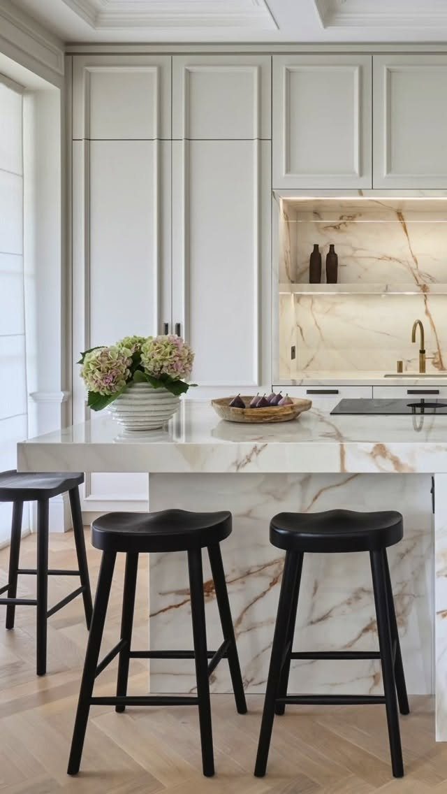
A good island does three jobs at once: prep surface, storage below, and seating on one side. Marble on that scale is not in the budget this reader usually has, but the idea transfers.
An island on locking caster wheels gives you the same flow in butcher block or laminate, and you can roll it out of the way when you need the floor space.
I would anchor it with a cooktop only if your wiring already runs there; otherwise, keep the surface clear and put the cooking on the wall run. The extra electrical for an island is a permit call in most jurisdictions.
3. Parallel Kitchen
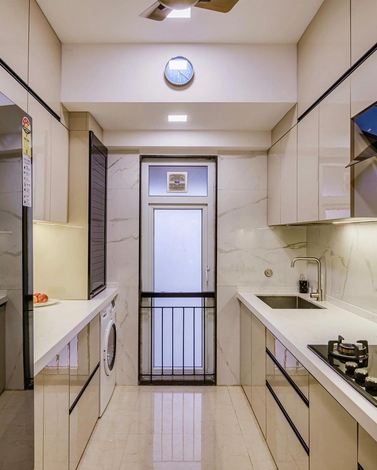
Two countertops facing each other across a 4- to 5-foot aisle turn a narrow room into a galley that actually works.
Appliances and cabinets on both sides, a back door at the end, and just enough room to open the dishwasher and the oven opposite without collision.
This layout lives or dies on the aisle width.
Too wide and you lose the efficiency, too narrow and shoulders brush every pass. Glossy cabinets bounce light down that tunnel, but matte hides fingerprints better if your household is busy.
4. Straight Kitchen
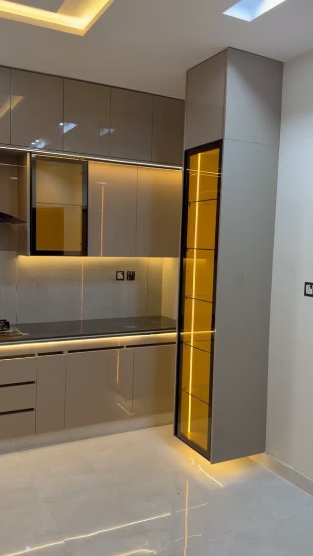
Everything on one wall is the only layout that works in a studio or a railroad apartment, and the photo proves it can look finished rather than temporary.
The taupe cabinets run floor to ceiling: flat-panel lowers for the work, glass uppers for display, and the warm strip lights underneath keep the counter from feeling like a cave.
A straight kitchen with a tall, freestanding pantry cabinet at one end breaks the boxy run and gives you pantry storage that reads as furniture.
In a straight kitchen, vertical variation matters more than in any other layout because there is no corner or island to interrupt the line.
5. Bold Colors Kitchen Cabinets
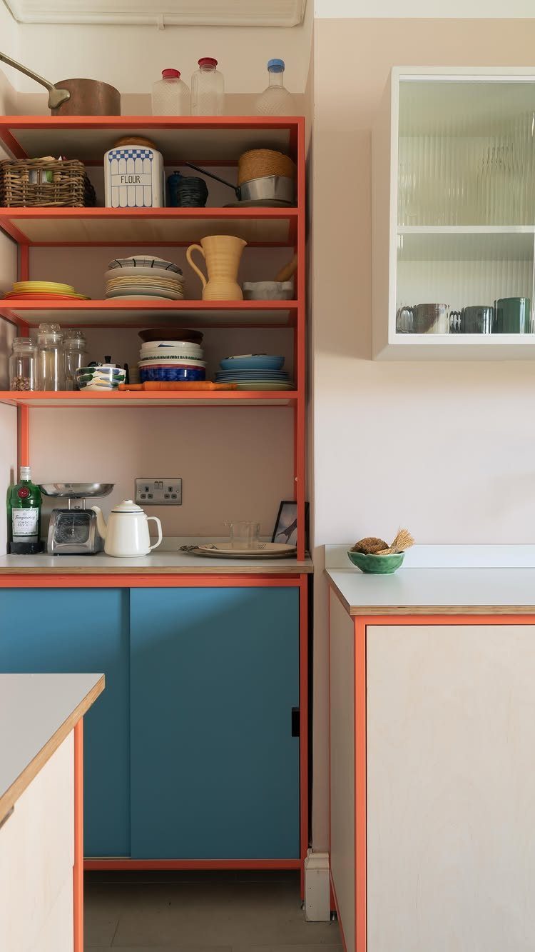
Orange shelving and teal sliding doors, the blue matched to a specific RAL code so you can order the exact same tone from a paint shop that mixes industrial colors.
That is a paint code, not a guess, and it is the kind of specificity I look for when I want color to look chosen rather than accidental.
Bold cabinets work best when the architecture is plain. White walls, simple hardware, and one strong color decision carry the room.
2 colors, as here, need a balance: the orange frames and shelves against the blue doors, both grounded by the white upper cabinet. If your budget allows custom paint on stock boxes, that is where I would put the money.
6. Open Kitchen Design
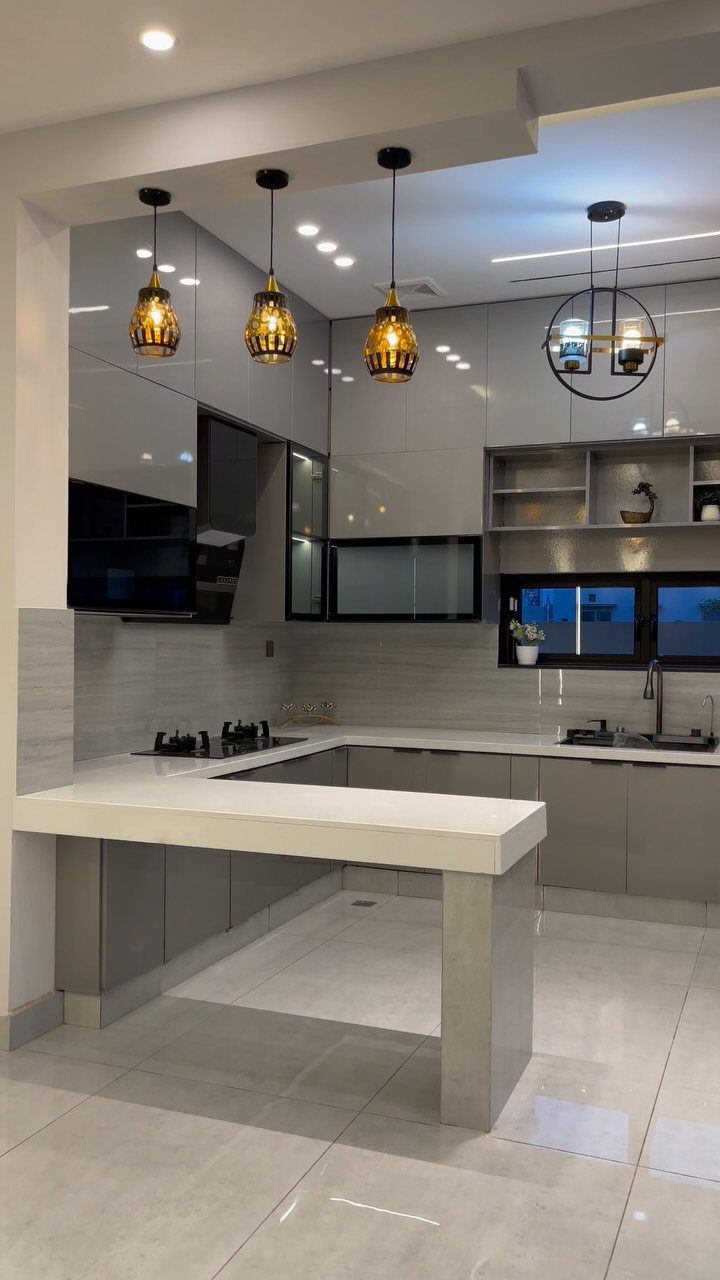
Grey cabinets run to a peninsula that juts into the living space with no wall to separate them. Pendants over the counter, and that overhang is where breakfast happens.
A peninsula costs less than a full island because it shares one wall’s structure and wiring. Plan the overhang depth for what the stools need, shallower for knees only, deeper if you want seats that spin toward the room.
The cooktop stays on the kitchen side of the counter run; I do not like open flame facing a living room, and most codes agree. Keep the social side for prep and eating.
7. Luxury Kitchen Design
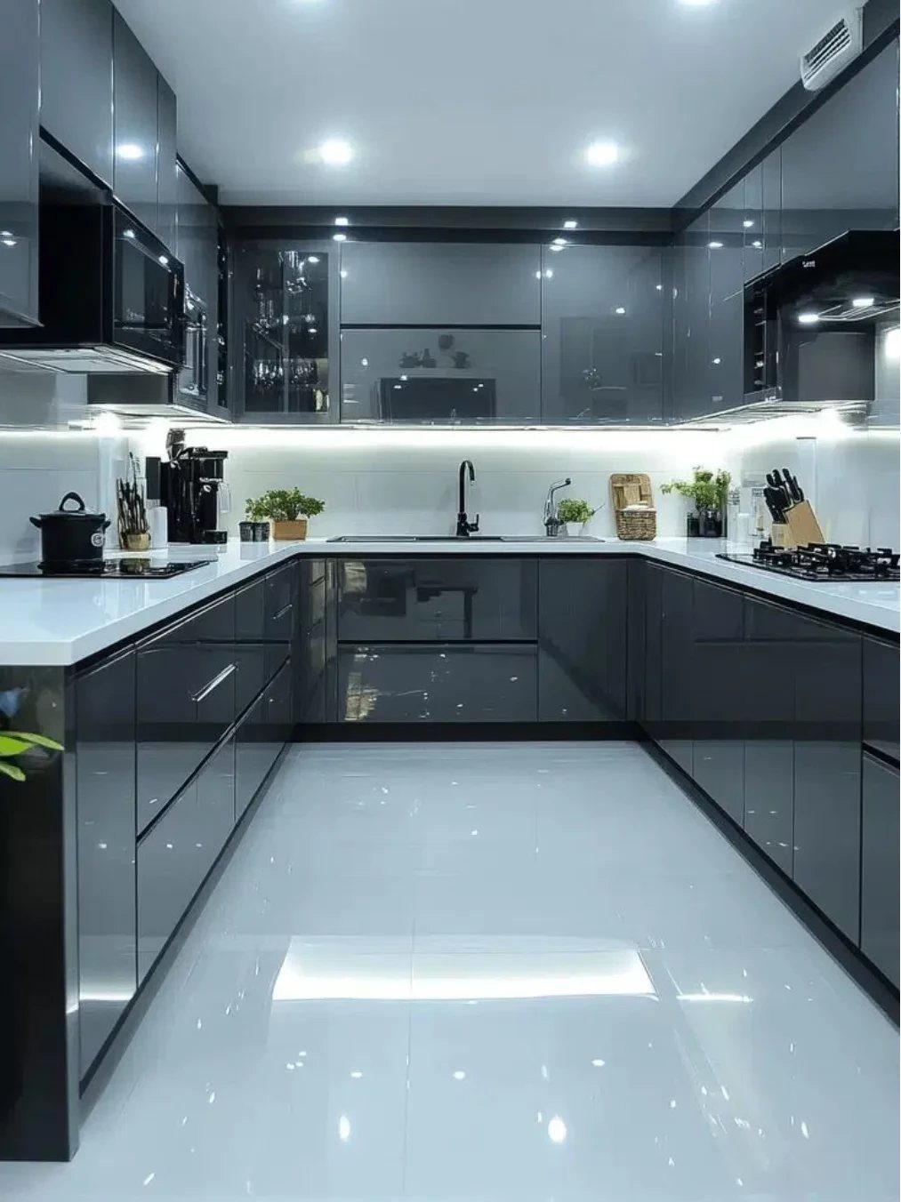
High-gloss dark gray cabinets with white countertops and under-cabinet lighting read expensive because the materials are consistent, not because any single piece cost a fortune.
The gloss reflects ceiling light down onto the work surface, which is what under-cabinet strips are for when the cabinets themselves are too dark to bounce light.
A black sink matches the appliance fronts so nothing breaks the plane.
I would keep hardware minimal on high-gloss; finger-pull grooves or tip-latch doors keep the surface uninterrupted. The floor here is glossy white tile, which shows every crumb but doubles the light.
8. Integrated Appliances
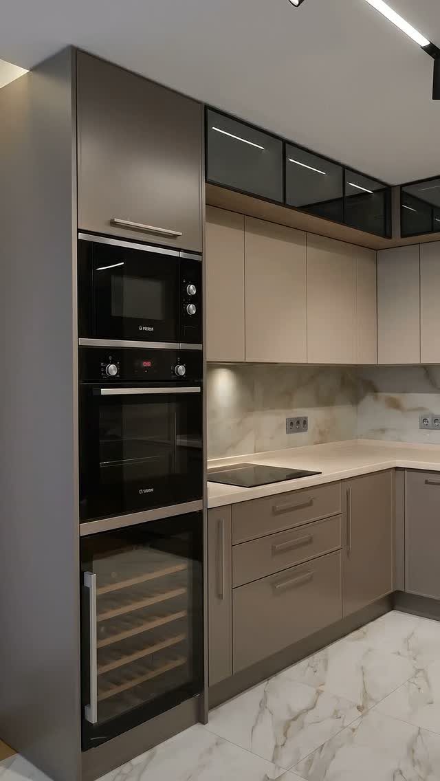
A wall oven, microwave, and wine cooler stacked in one cabinet column with matching faces disappear into the run.
The induction cooktop sits flush in the counter with no bridge piece; that flush fit keeps crumbs from collecting and makes wiping the counter one straight motion.
Integration costs more than standard installs because the cabinetmaker builds the surround and the appliance supplier provides the unbranded panel.
Budget for both quotes. I would stack only appliances I use in sequence: oven above microwave makes sense, wine cooler at eye level if you grab a bottle while cooking.
An integrated appliance setup keeps the backsplash surface flat, with no gaps or protrusions to break the line.
9. Good Ventilation
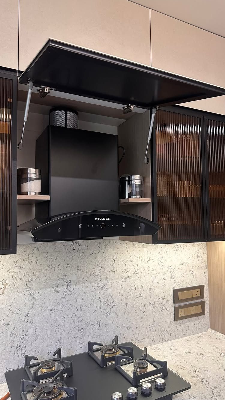
A range hood ducted to the outside is the minimum I would accept over gas, whether it is built into a cabinet or hung open below.
Recirculating hoods trap grease in filters and blow humidity back into the room; they cost less to install and more in wall damage later.
The fluted glass cabinet doors beside the hood soften the run without blocking light.
Hood depth should cover the front burner, which matters more than total cfm for actually catching grease and smoke, and the bottom of the hood sits low enough to catch effluent before it rises past the capture zone.
Higher looks better and works worse. Matte black hides the oil film that shows on stainless in a week of frying.
10. Open Shelving
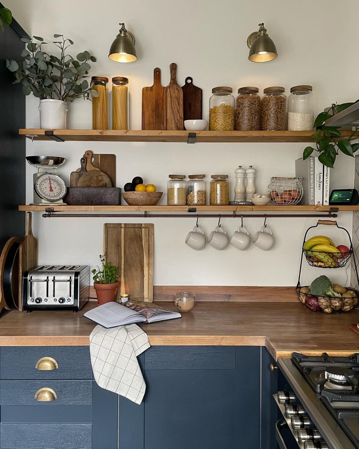
2 wood shelves with a hanging rod underneath replace wall cabinets entirely in this section. The dark blue cabinets below give the kitchen its storage; the open part is for what you use daily and do not mind dusting.
Wood thickness matters for the span: 1.5 inches of solid birch or oak holds 36 inches without sag, thinner needs a hidden bracket.
I would stain rather than paint open shelves; paint chips where plates slide. The rod for mugs is a ½-inch black steel pipe with floor-flange ends, a hardware-store piece that costs less than kitchen-specific pot rails.
11. Countertops
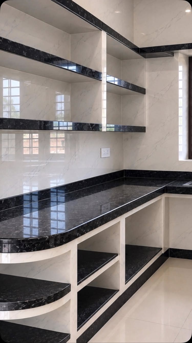
Black polished stone with bullnose edges and a white speckle reads granite or quartz; the open lower shelving below replaces base cabinets with legs for a lighter piece that still anchors the room.
Bullnose rounds the top and bottom edge, a finish that predates the thick mitered waterfall look and suits older houses better.
The electrical outlet on the counter back is code-required at regular intervals; plan for it before the stone is cut.
I would not do open lower shelving under a sink, but for a dry prep area the lack of doors speeds the work.
12. Kitchen Lights
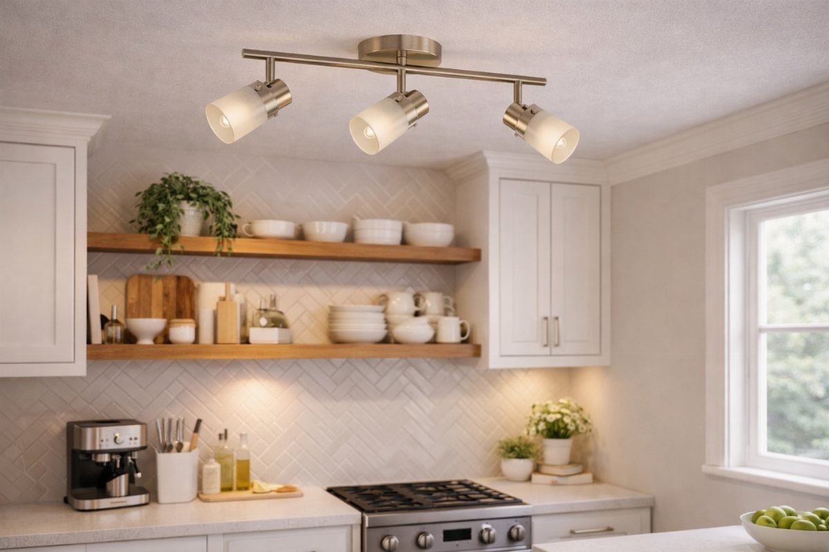
Track lighting with 3 brushed-nickel heads on a ceiling mount lets you aim each bulb where the work happens, not where the fixture was centered by an electrician guessing at cabinet placement.
LED PAR30 bulbs in warm white, 2700K to 3000K, keep food looking like food; 4000K and above turns meat gray and bananas beige.
A textured backsplash catches each beam at a different angle, which is why surface variation reads under track lighting and goes flat under flush mounts.
Install the track forward of the cabinet face so the light falls on you and the work, not in your eyes.
13. Solid Wood Base Cabinets
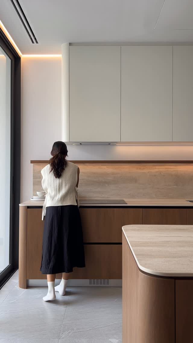
White uppers keep the ceiling high, and the wood below carries the warmth. Walnut or teak base cabinets ground the room without closing it in, and the curve in the island softens the boxiness that straight runs usually give.
I would pair matte white lacquer on top with oiled wood below rather than staining both to match; the 2 finishes let each do its job.
A closed kick plate hides dust better on dark floors, though open toe-kicks keep the island visually lighter.
14. Traditional Style
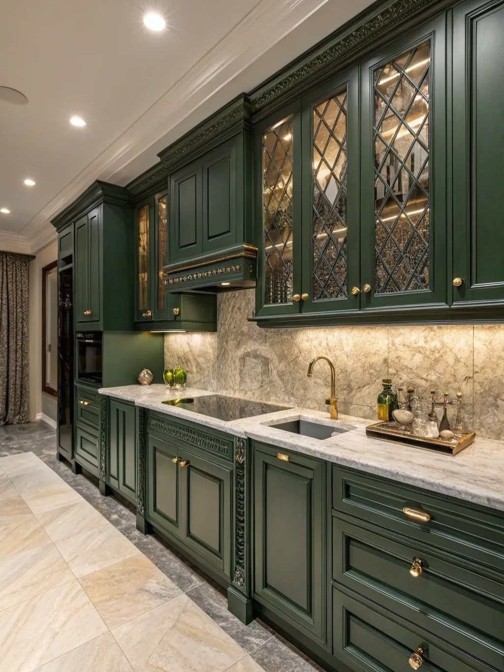
Dark green paint, raised panel doors, and brass pulls read established rather than trendy. The diamond glass in the uppers breaks the solid mass without exposing everything inside, and marble with gray veining ties the green to lighter floors.
I would not do this in a small room; the molding and the color both need breathing room.
Induction keeps the vintage look while losing the venting headache of gas, and an undermount sink lets crumbs wipe straight off the marble into the basin.
15. Minimalist Kitchen Design
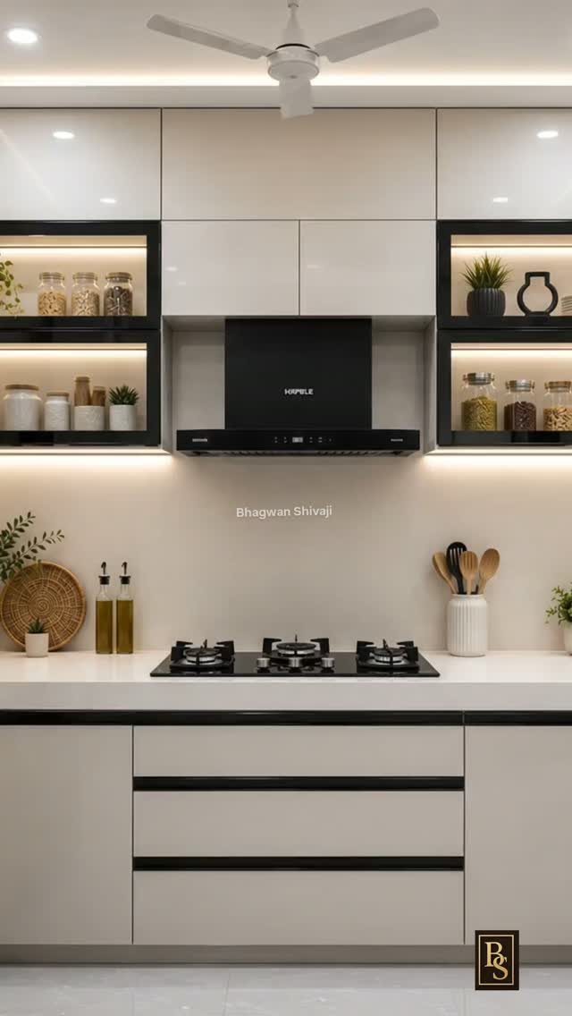
Handleless beige cabinets with black trim sit below lit, open shelving that runs flat across the wall.
The trim is not decorative; it is the gap line that lets doors open without pulls, and getting it straight takes a cabinetmaker who measures twice.
Backlit shelves need their wiring planned before drywall; retrofitting means chasing walls. The range hood in black matches the trim band and disappears against it, while the gas cooktop stays usable for cooks who want flame without the visual clutter.
I would keep countertops in the same warm tone, not white; the calm comes from limitation, not contrast.
Scavolini offers over 20 models of kitchen, with styles ranging from sleek minimal to rustic industrial. Every design has coordinating accessories with special attention paid to storage and practicality.
Choosing the Right Layout
L-shaped, U-shaped, parallel, island, and straight-line layouts each suit a different room shape and how many people cook at once.
U-shaped kitchens give 3 walls of counter and storage, which works when the room is large enough that the enclosed space does not feel like a corridor.
I would measure the room first, then match the layout to the footprint rather than forcing a favorite shape into a space that penalizes it.
Budget Considerations
In India, modular kitchen prices start around Rs 1.7 lakh and run to Rs 3 lakh for a basic build in a standard apartment.
The city matters, as does kitchen size and material choice. I would get two quotes: one for the cabinet carcasses and finishes, another for the countertop and hardware specified separately, because the total is where the surprise hides.
Importance of Ventilation
A weak hood mounted too far from the outside wall vents grease back into the room, and the film settles on cabinet faces you just finished paying for.
Keep the fridge out of the stove’s heat zone; the compressor runs longer when it sits next to a cooktop, and the power bill shows it.
Frequently Asked Questions
What is the best design for a modular kitchen?
The best design matches your room shape more than any trend. An island works if you have the floor space and existing wiring, while a straight run is the only realistic option in a studio or railroad apartment.
What is the 3 kitchen rule?
The kitchen triangle rule keeps the stove, sink, and refrigerator in a triangular layout so you do not cross more steps than necessary while cooking.
It prevents congestion when multiple people work, and it keeps the cooking zone separate from the cleaning zone so the work flows in one direction.
Parallel and U-shaped kitchens handle this best because the 3 points sit on opposite walls with the aisle between them.
What are the disadvantages of modular kitchens?
Modular kitchens cost more up front than site-built cabinets, and high-end materials push the price higher quickly. Repairs can take a technician familiar with that specific system, and you lose the option of a local carpenter patching one broken door.