The one question that picks your project is whether you rent and need to leave no trace, or own and can cut into walls.
If you are renting, the copper S-hooks on a tension rod or the wheeled steel cart leave with you; a bold backsplash tile or a mounted pot rack probably stays behind.
[link-whisper-related-posts]1. Install Floating Shelves
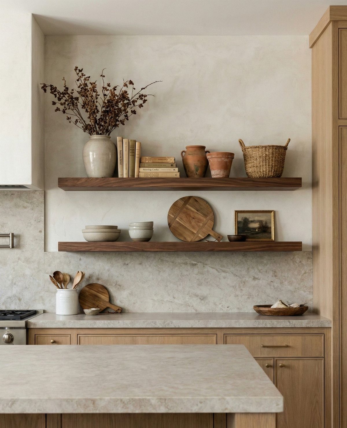
Thick floating shelves give you storage without swallowing floor space, which matters when every square foot counts.
I like the mix of books, pottery, and cutting boards layered at different depths. The shelves themselves carry the visual weight, so the styling stays light.
For a weekend install, buy brackets rated for more than you plan to load. I prefer solid wood over hollow-core; it holds anchors better and the front edge looks finished without a cap.
A shelf pair runs less unfinished than finished, plus brackets. Paint or stain to match or contrast your cabinets; either reads as intentional.
2. Hang Artwork or Prints
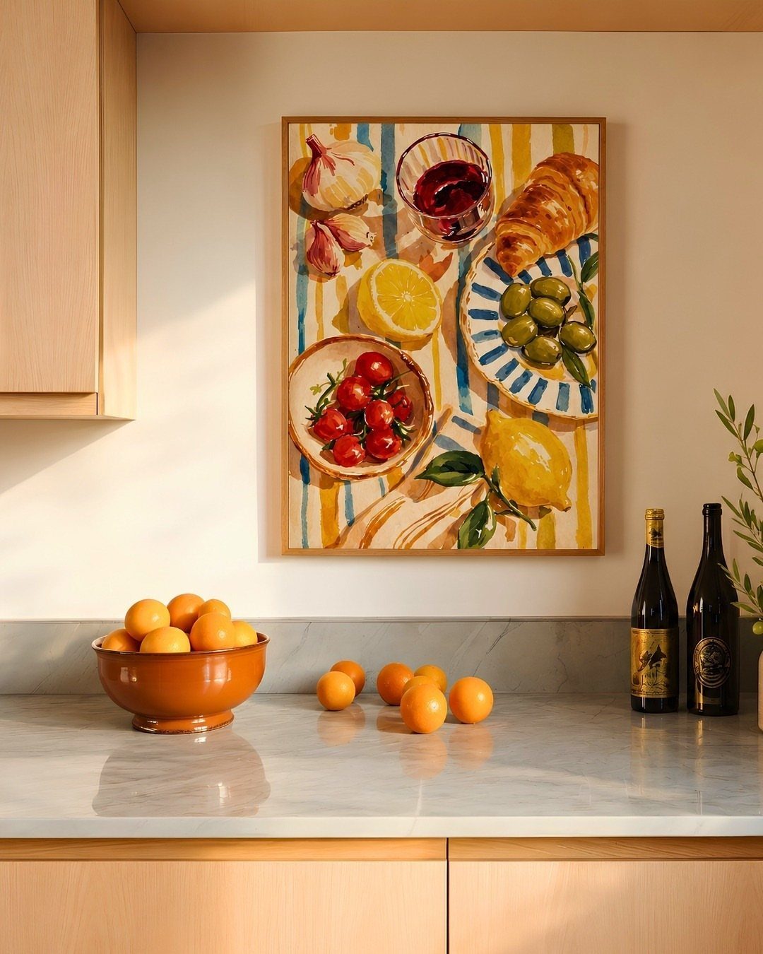
A kitchen wall is usually the last place people think to hang art, which is why it works.
Food subjects feel obvious but effective: they belong in the room without fighting it.
What I look for is a frame finish that picks up metal or wood already in the kitchen, so the art lands as part of the plan, not an afterthought.
Prints on paper need glass; canvas skips that worry and wipes clean with a barely-damp cloth.
For renters, Command strips rated for the actual weight hold light framed pieces. Heavier frames need a real anchor and patch later.
3. Bold-patterned Backsplash
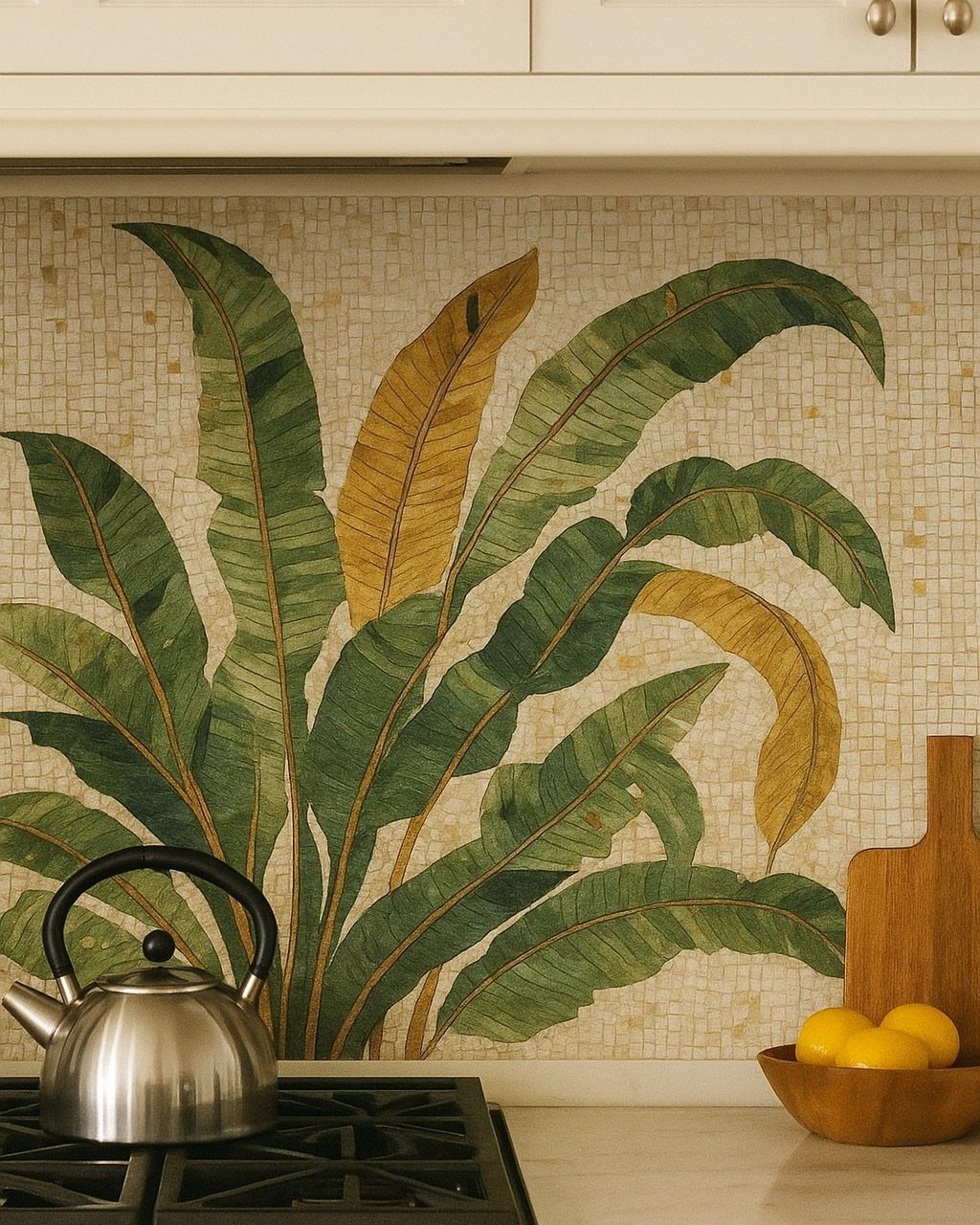
A backsplash is the one surface small enough to go loud without exhausting the eye. A tropical leaf mosaic reads as wallpaper but survives splatter; that’s the practical case for tile over paper.
Sheet mosaic installs faster than individual tiles but limits your layout options. I would check that the pattern scale suits the wall length; a large repeat cut short looks broken.
Grout color matters as much as the tile: matching grout quiets the pattern, contrasting grout grids it. Either is fine, but decide before you buy.
This is a full-weekend job with thinset cure time. Rent a tile saw or buy extra tile and accept some waste.
4. Two-tone Cabinetry
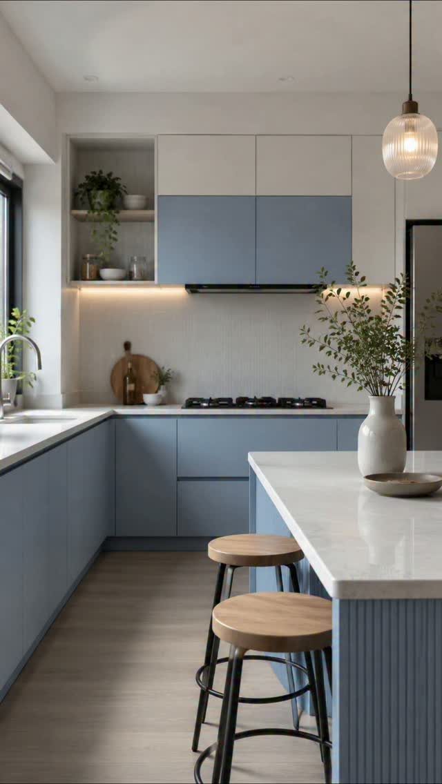
Painting lower cabinets a darker shade and uppers light or white is the most reliable two-tone scheme I know. It grounds the room visually and hides scuffs where they collect.
Muted blue against white reads as coastal without announcing a theme.
What makes it work is the counter bridging both: a single surface color keeps the kitchen from splitting into 2 rooms. Wood floors do the same job, carrying under both cabinet tones.
A gallon of cabinet paint goes farther than you’d think; 2 coats are non-negotiable. If your existing cabinets are thermofoil, adhesion fails there, so this idea suits painted wood or MDF better.
5. Small Spaces
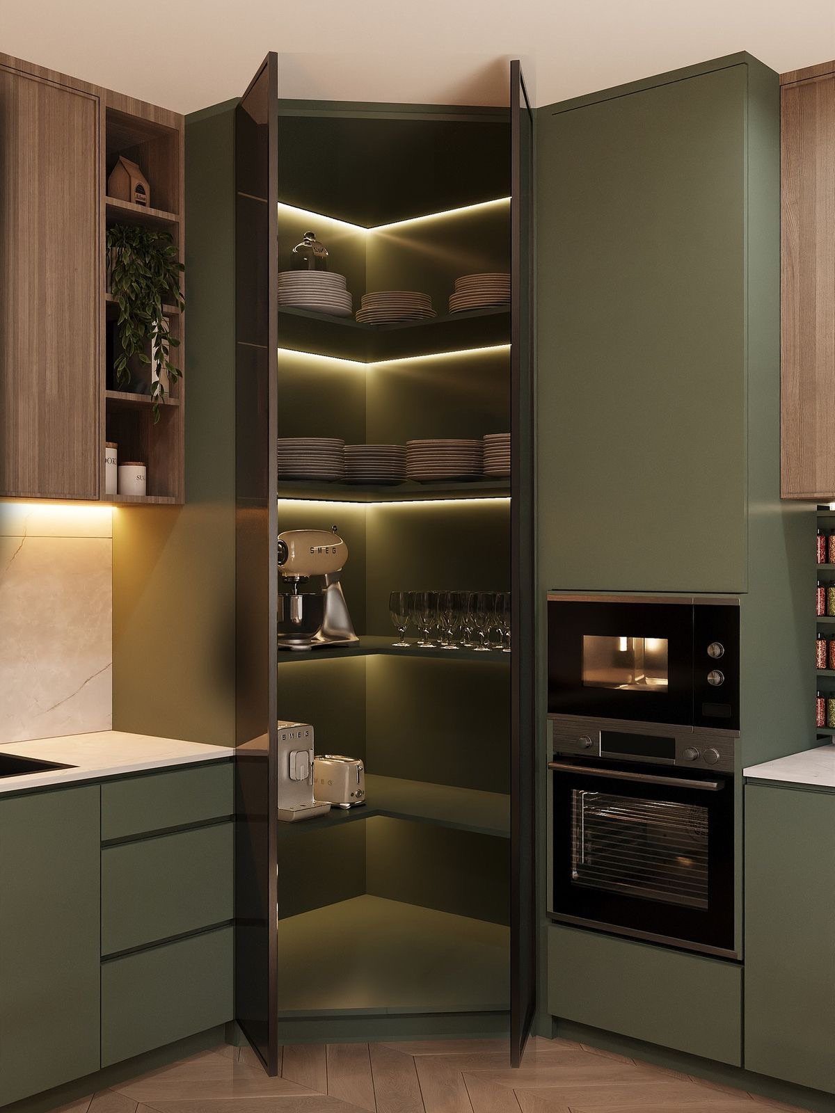
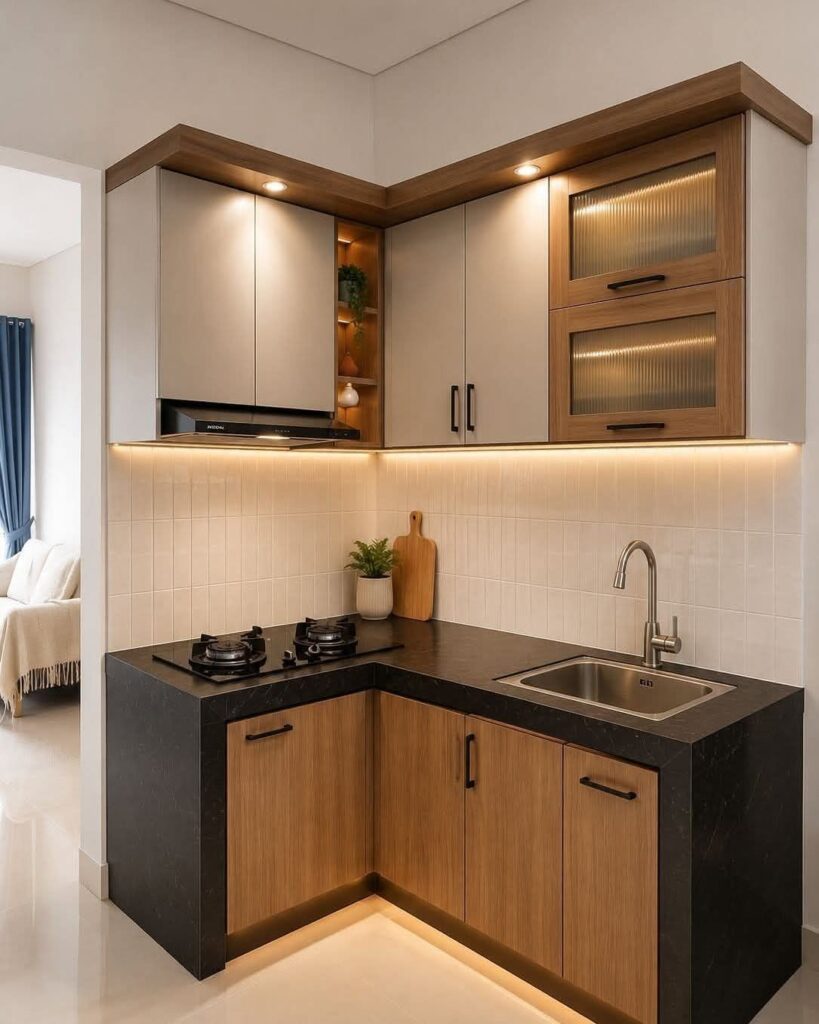
Corner cabinets waste depth unless something brings the contents forward. Bi-fold doors and pull-out tiers solve that with hardware, not magic.
LED strips inside are worth the cost; shadowed corners read as smaller than they are.
What this idea trades away is countertop corner access. The upper cabinet depth eats the angle where you might prep.
6. Install Under-cabinet Lighting
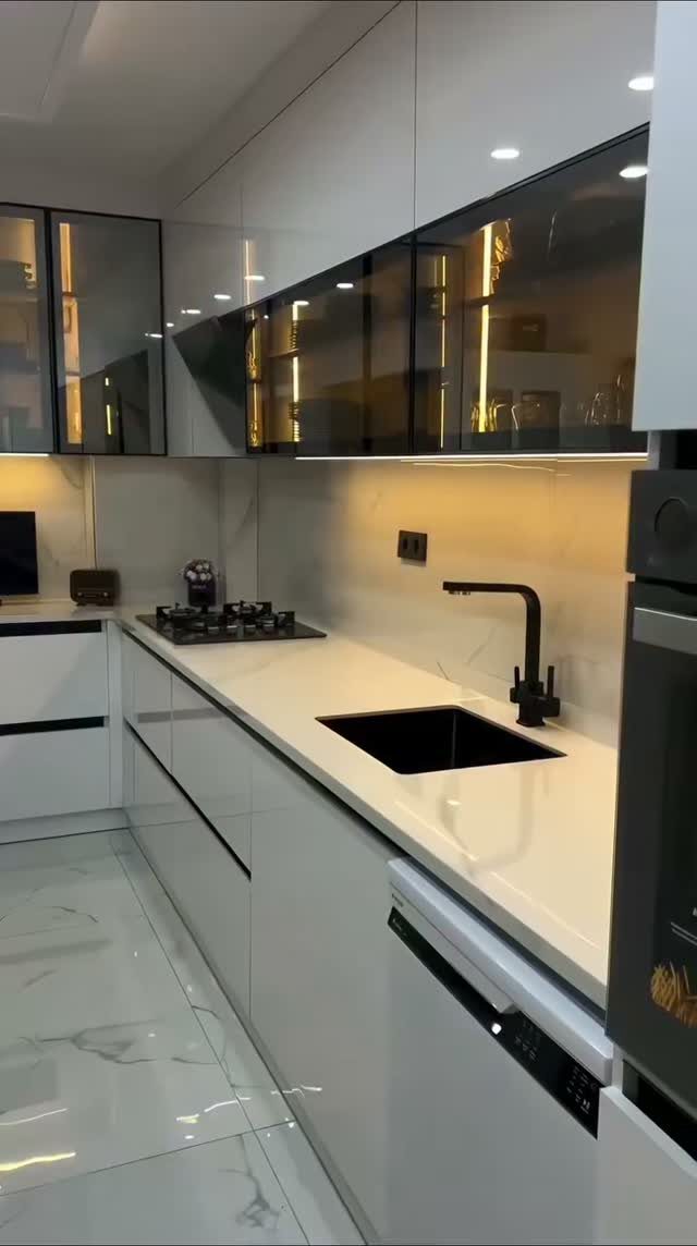
Strip lighting under upper cabinets turns counter space usable after dark. Warm LEDs pick up the glass cabinet glow, so the whole wall reads as designed rather than patched in.
Hardwired strips look cleanest but need an electrician if you are not comfortable with junction boxes.
Plug-in versions with a switched outlet work for renters; a small cord channel in paintable plastic hides the run. I aim for 2700K–3000K color temperature, warm enough to flatter food without yellowing it.
Size the strip to the cabinet length, not the counter; light spilling past the cabinet edge looks like a mistake. A quality plug-in kit costs less than you’d expect.
7. Incorporate a Pull-out Pantry
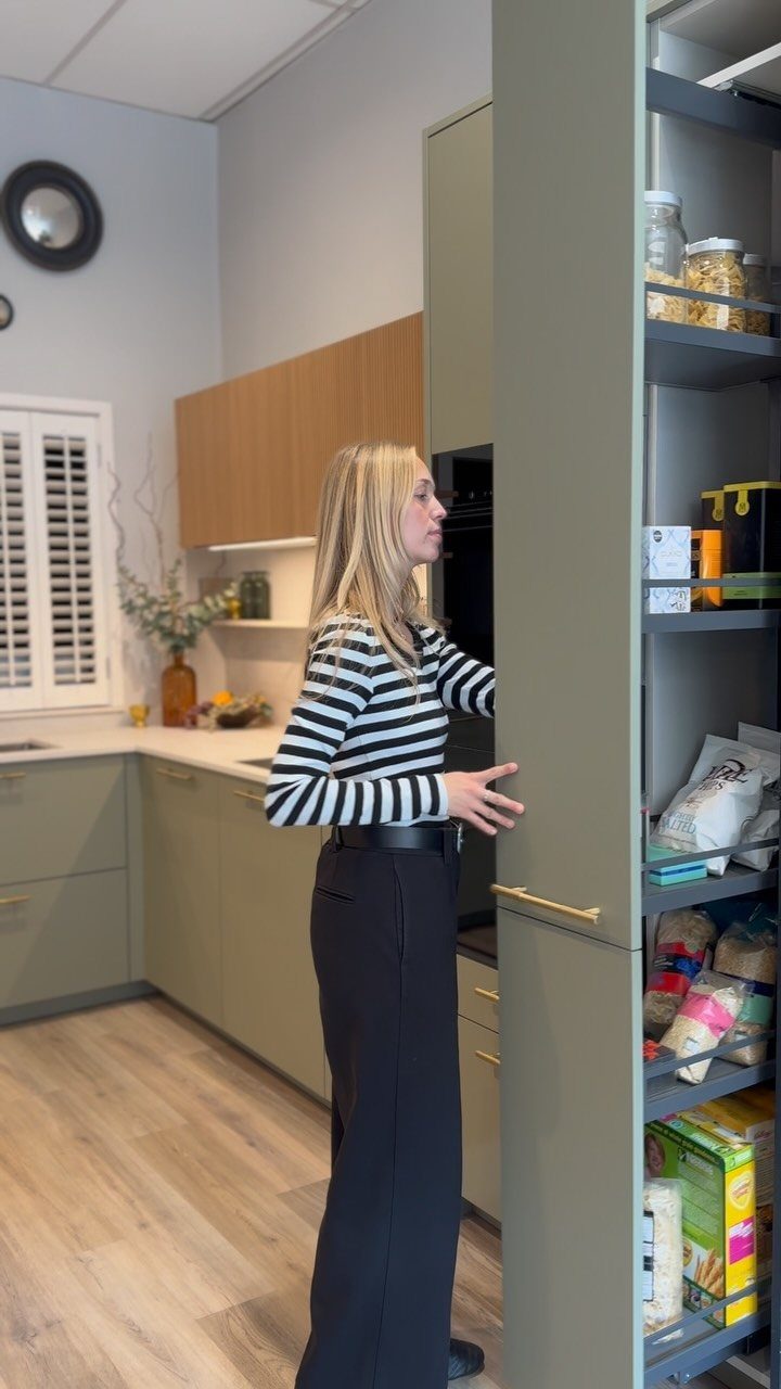
Pull-out pantries run surprisingly narrow and still hold a week’s dry goods. The vertical format fills gaps beside a fridge or at the end of a cabinet run where deep shelving goes to waste.
Adjustable shelves matter more here than in standard cabinets; cereal boxes and spice jars share one tower.
I would look for full-extension slides with a high weight rating, since the load stacks high. A soft-close finish keeps the glide from slamming when your hands are full.
Sage green or natural wood, the face reads as intentional millwork rather than afterthought storage.
8. Install a Pot Rack
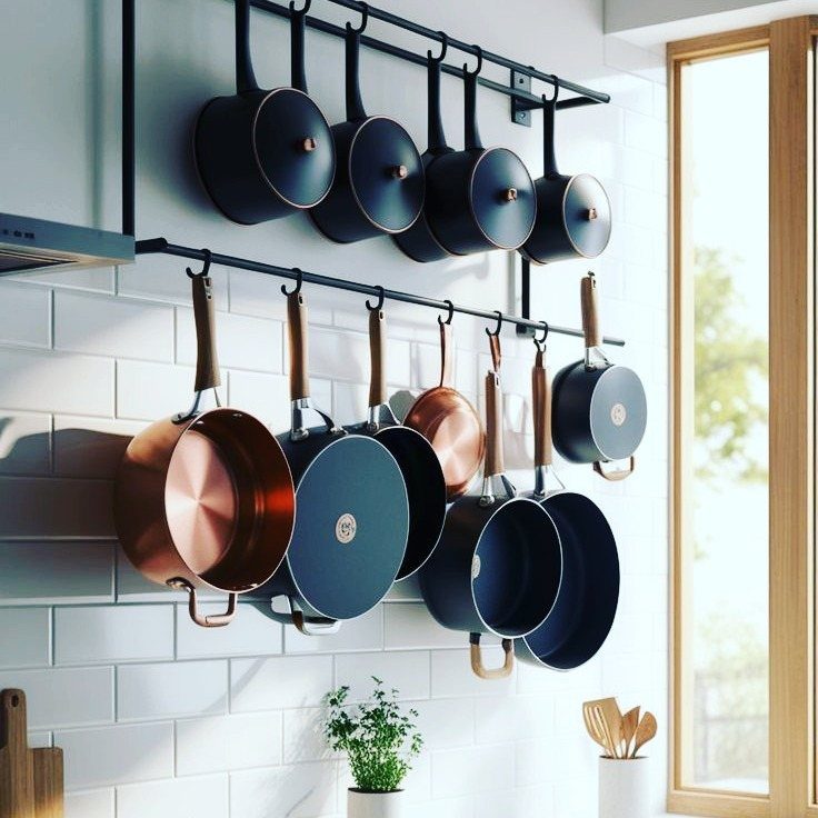
Ceiling racks steal headroom; wall-mounted rails keep pans at hand without the reach.
Hooks or S-hooks hang at staggered depths so lids and handles nest without knocking. A stud anchor or toggle bolt per end is non-negotiable; drywall alone pulls loose.
9. Compact Appliances
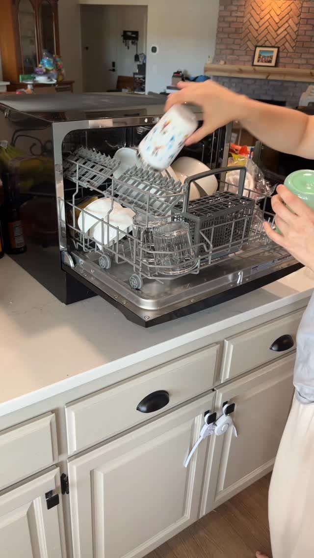
A countertop dishwasher with its own water tank skips the plumbing hookup. Compact dishwashers fit a day’s dishes for a small household, not a dinner party, and the footprint sits where a microwave might.
Plugs into a standard outlet; drains to the sink through a short hose.
The maker priced it for apartments, dorms, RVs, and the workflow it fits is exactly that: daily use, small loads, no remodel. I would still measure cabinet-to-counter clearance; the lid lifts and needs room.
Trade-off: the tank fills manually, so this is not a set-and-forget machine. It is a workable dishwasher where none was possible.
10. Tension Rod with S-hooks
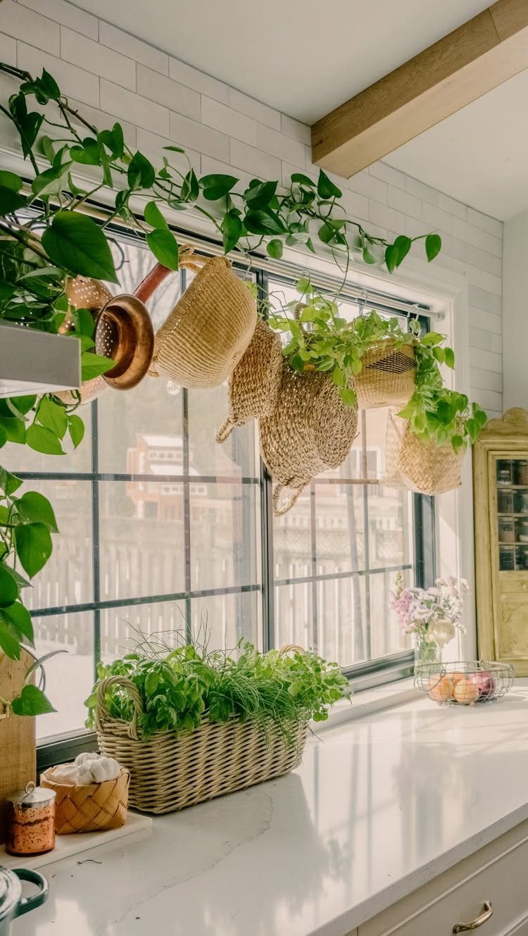
A curtain rod in a window frame becomes hanging storage when baskets outweigh the view. Copper S-hooks carry woven bins and a pot without drilling tile or wood; the tension holds by pressure, which means a limit.
Weight capacity varies by rod diameter and span; the longer the reach, the softer the grip.
I would test load before trusting plants or produce overhead. The marble counter below catches what falls.
This suits renters precisely because it leaves no mark. Sun on herbs is a side benefit; the main useful fact is storage in air that costs nothing.
11. Monochromatic Color Scheme
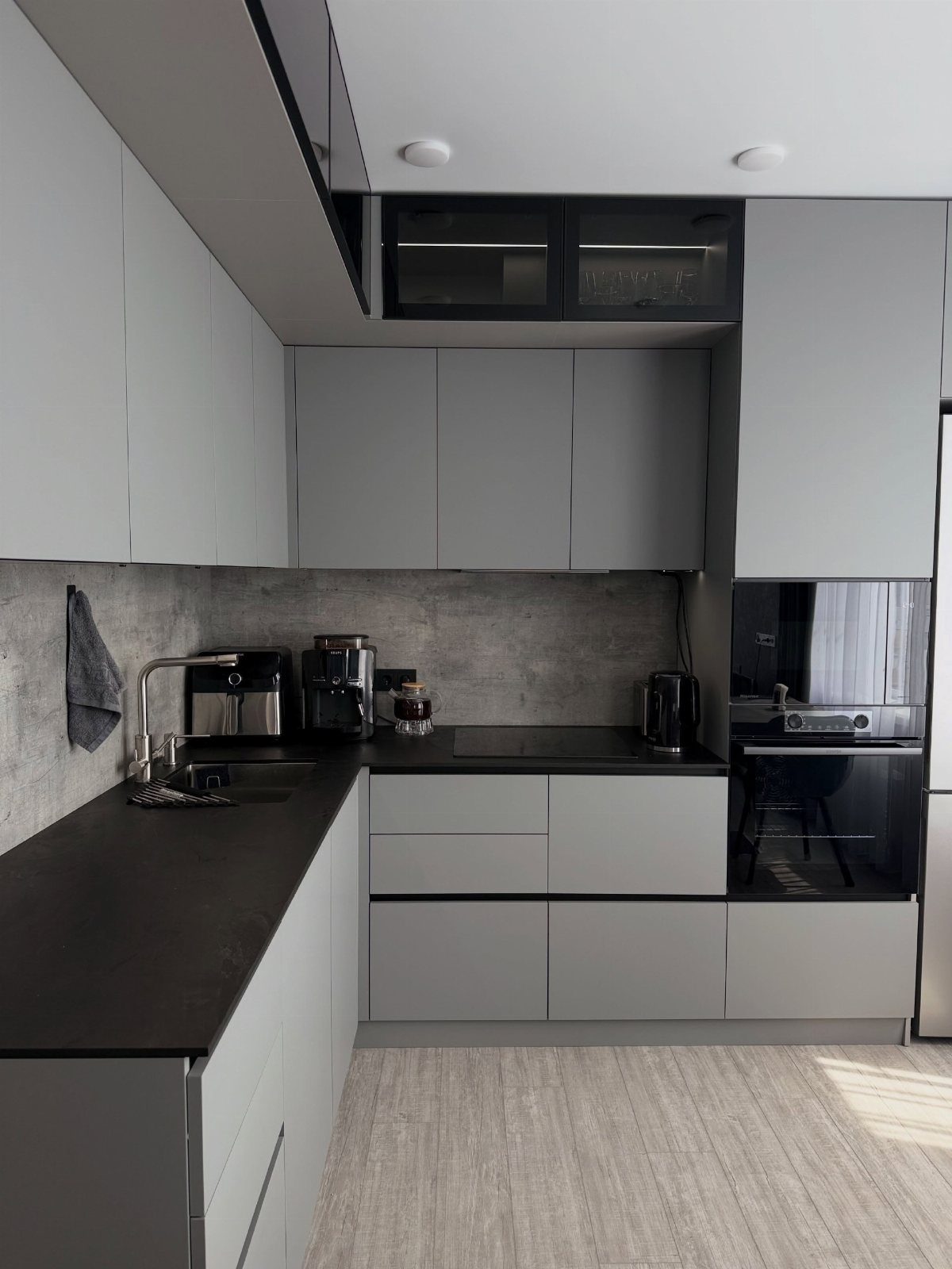
Grey on grey reads as intentional only when texture does the variation. Matte cabinets, concrete-look backsplash, and smooth black counters layer three finishes in one tone; without that, the room flattens to a box.
The black oven and coffee maker read as shadow rather than contrast, which is how monochrome stays calm instead of stark. Light wood floors warm the whole thing; without them, I would add copper or brass at the pulls.
A single-tone kitchen hides smallness better than white, which reflects every angle. It also forgives inconsistent natural light; the same grey reads morning or evening.
For Feldman, this penthouse kitchen Washington, DC, was about contrast used with restraint. “The blue paint is rich but muted, so it holds its own without overpowering a small footprint,” the designer says.
12. Pegboard for Utensils and Tools
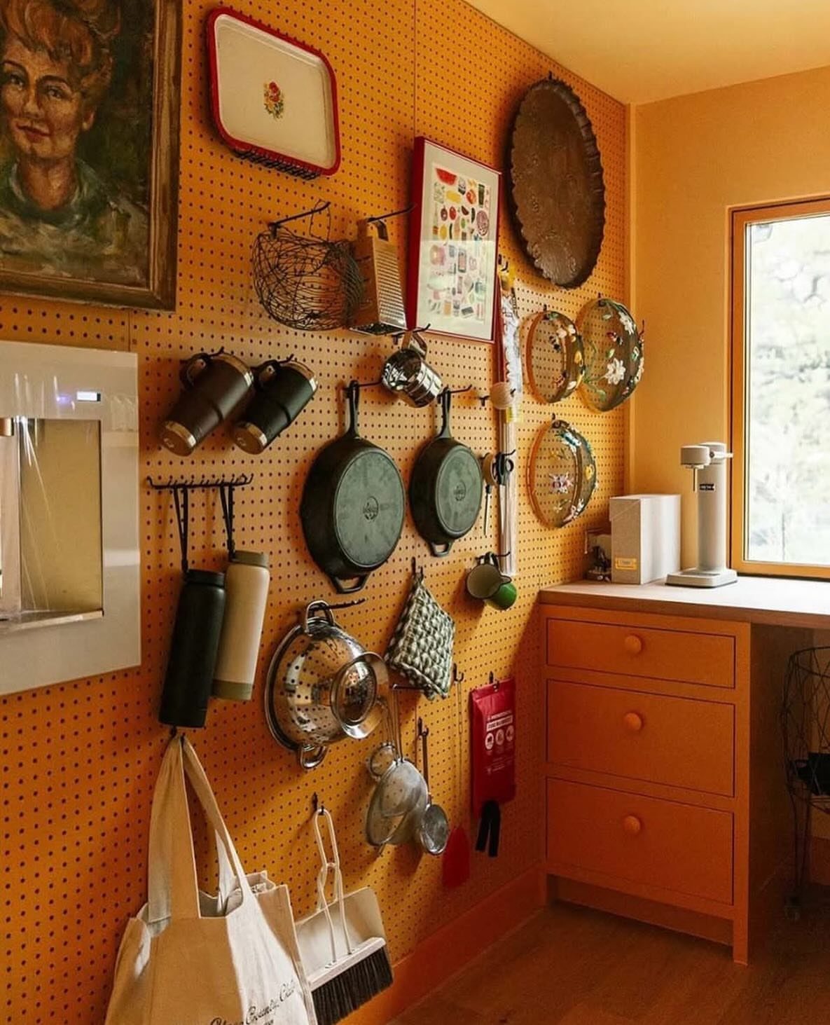
Orange pegboard turns storage into wall color, so the choice of panel is the design move. Hooks, shelves, and bins reconfigure in minutes; what hangs adapts faster than any cabinet interior.
Cast iron weight needs a board on blocking or a substantial anchor; the hook slot alone is thin metal.
I would place heavy pans low, where torque on the fastener is less, and keep cups and tools at arm height. The grid looks busy fast, so I limit mine to one color of hook and one material of tool.
Paintable hardboard lets you match or depart; here the orange picks up the cabinet, and the whole wall becomes feature.
13. Hide Appliances
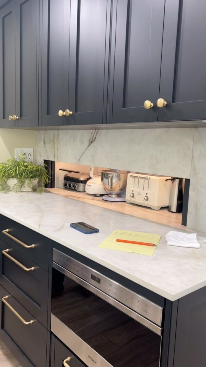
A recessed shelf at counter depth swallows the toaster and kettle whole. The cabinet face drops or slides, and the clutter is gone without hauling anything to a closet.
I would size the recess to your tallest appliance plus an inch, and add an outlet inside; the cord stays put instead of snaking across stone. Position it near prep space if you actually use what you store.
The trade is losing that stretch of counter for staging. In a small kitchen, that matters, so this idea suits people who value calm over spread-out workspace.
Deep cabinets with appliance garages and slide-up doors hide appliances under countertops to keep daily-used items accessible yet out of sight.
14. Magnetic Spice Rack

Hex jars with metal lids grip a refrigerator side in a honeycomb grid. The shape tiles tight, no gaps, and the contents show through glass so you find paprika without reading labels.
Strong neodymium magnets hold full jars; standard fridge magnets fail.
Test before you commit your whole collection to the wall. I would keep the grid to the side panel, not the door, where swinging jars collide with passersby.
Cost runs low: bulk hex jars, a label maker, and magnet discs epoxied to lids. The project takes an evening, not a weekend.
15. Gloss Kitchen Cabinet Doors
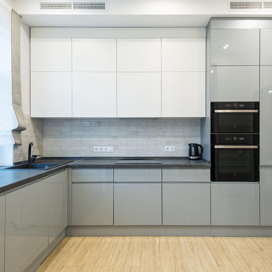
Gloss bounces what light a small kitchen gets, so the room reads larger than its footprint. Matte surfaces absorb; gloss returns it, even from a single window.
Dust and fingerprints show more than on matte, which is the real cost.
Dark gloss is the worst for smears; light grey or white forgives more. I would pair gloss lowers with matte uppers so the shine stays below eye level and the ceiling feels higher.
Cleaning is standard glass cleaner and a microfiber cloth. The finish survives it if you skip abrasives.
16. Maximize Natural Light
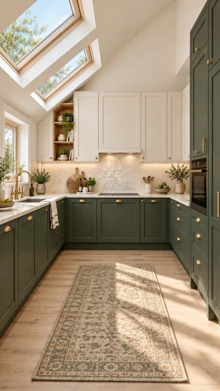
Angled units throw morning light deep across the counters; flat skylights sit too flush to do the same.
I would keep upper cabinet faces light to reflect that light downward. Dark green lowers absorb, which works at shin height but would kill the effect higher up.
A light-colored paint on cabinets and walls does similar work without the roof cut, and it keeps the deposit safe. The tube runs through attic space and lands as a ceiling disc; installation is still professional, but reversible.
17. Incorporate a Small Herb Garden
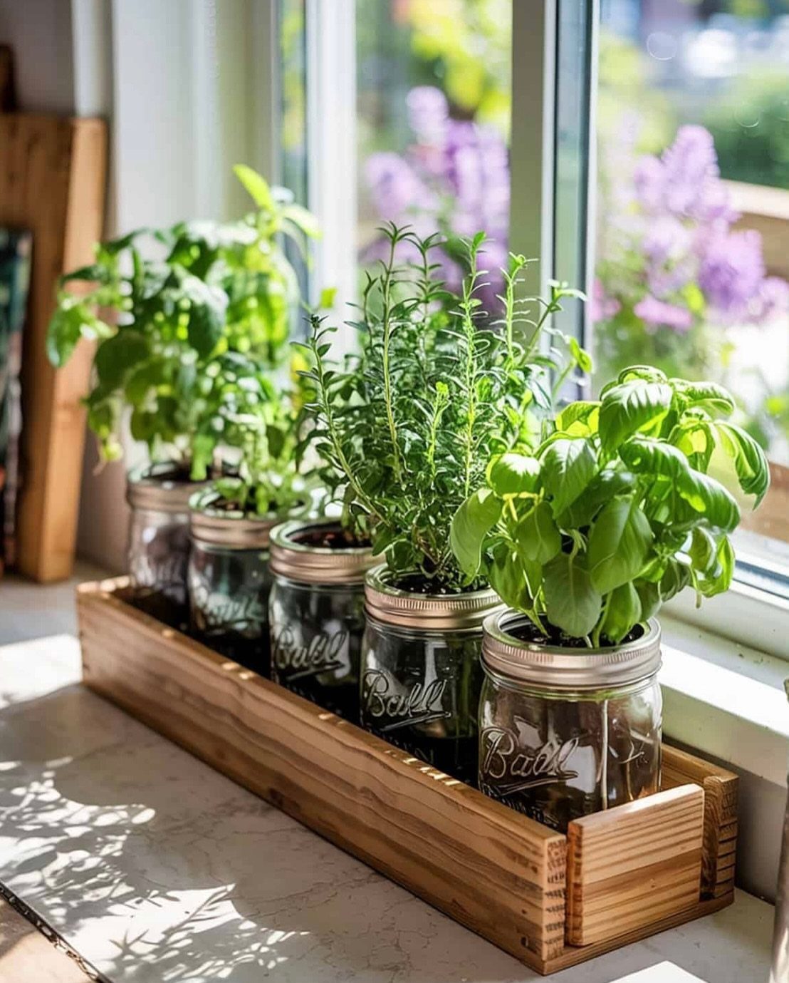
A wooden trough tucked on the windowsill holds enough jars for basil, thyme, and cilantro within reach of the sink. The jars sit nested, not planted through, so you lift one for washing without disturbing its neighbors.
Drainage wants a layer of pebbles at the bottom; roots rot in standing water.
I would add a saucer inside the box or accept the wood aging with water marks. Basil and mint grow fast enough to harvest weekly; rosemary stays compact and perennial.
South- or west-facing sills work; north light greens leaves without flavor. The setup costs little: jars from a yard sale, a box cut to fit the ledge, potting mix, and seeds.
18. Fold-down Table
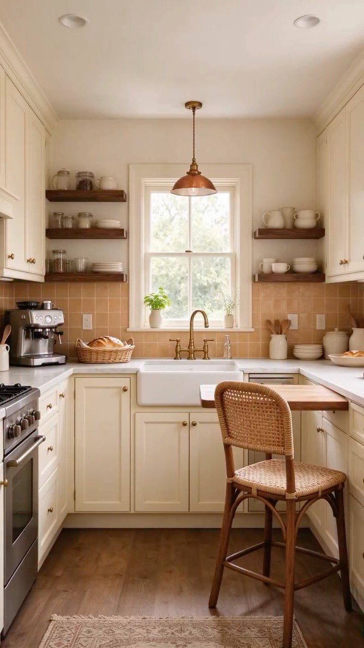
A wall-mounted leaf drops when you need a surface, vanishes when you need floor.
The bracket locks flat or folds vertical, and the hardware is common: a locking hinge pair, a board cut to size, and a stud anchor per side.
I would finish the underside with the same paint as the wall so it reads as panel, not afterthought.
At bar height it pairs with a stool; at standard height, a chair. The example uses wood tone against cream cabinets, which warms the whole wall.
The maker notes color palettes set to make a big impact in 2026. Warm or cool, the fold-down works if you match its tone to the room’s plan.
Weight limit follows the bracket rating; I would not lean on it, but daily meals hold fine.
19. Use a Rolling Cart
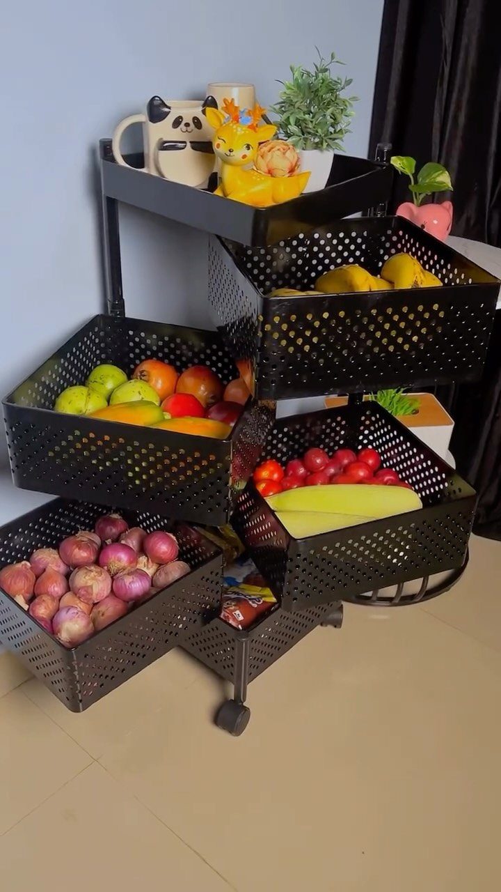
Metal tiers on casters turn any wall into pantry space you can roll to the counter when you need it.
Perforated steel basket weave keeps the cart light enough to move loaded and open enough that you see the onion before it sprouts.
I would weight the bottom tier heaviest, keep the top for things you grab daily.
Most carts are sized for narrow aisles, so measure yours before you buy. The black finish hides the scuffs that come from daily rolling.
In a rental, this is storage that leaves with you.
20. Small Dining Table Nook
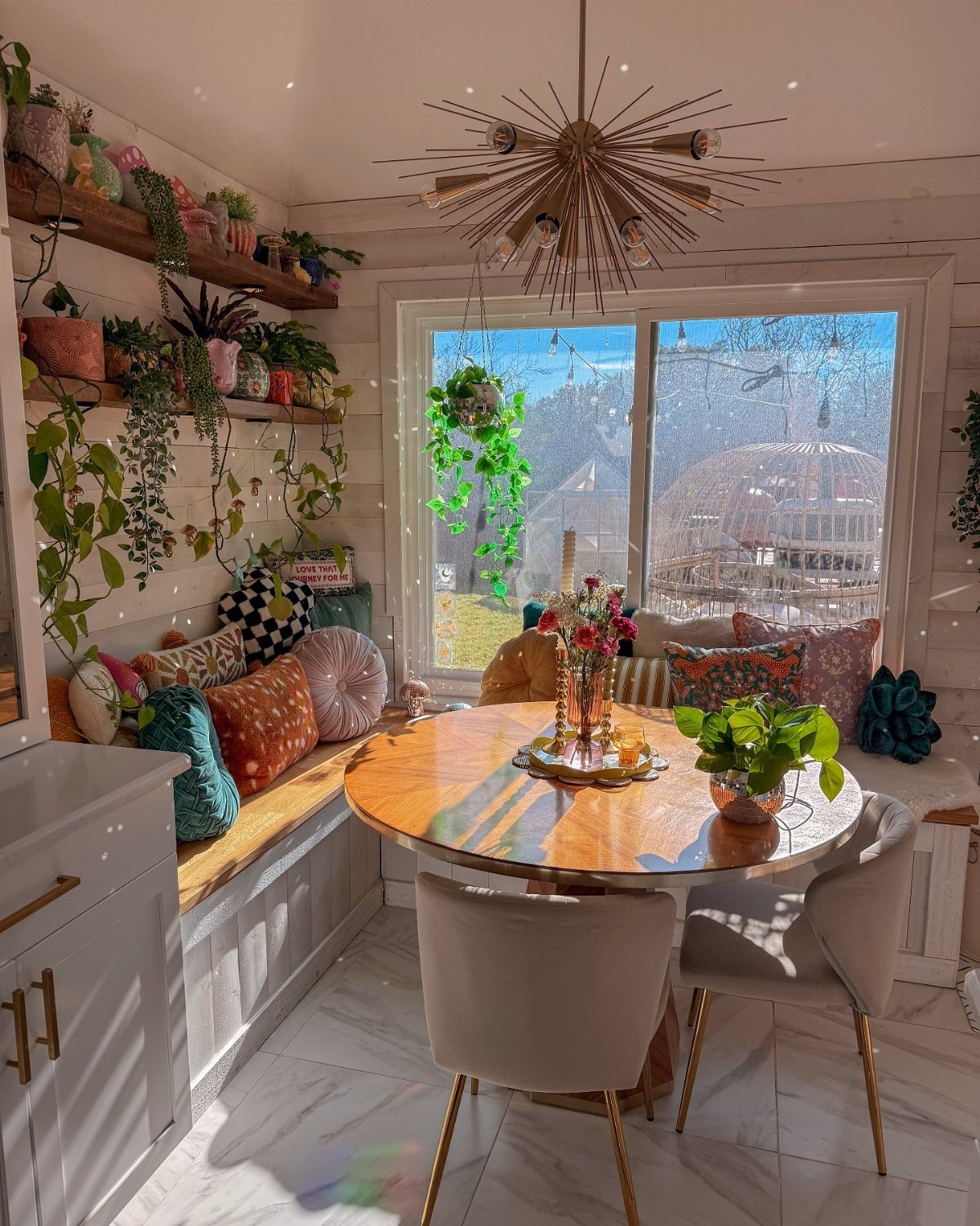
A round table in a corner eats no more space than the chairs require, and the curve lets people squeeze past when someone stays seated.
The built-in bench against the window wall stays put, but it seats two in the space of one chair’s footprint. Cushions there are cheaper than upholstered seats and read as softer against the hard kitchen edges.
I would keep the table wood tone warm; the surrounding cabinets are usually cool, and the contrast marks this corner as living space, not prep.
A sputnik fixture hangs high enough that heads clear it standing; the branches throw shadow that complicates the corner without cluttering it.
Plan for Efficiency
Three zones are enough for most small kitchens: one strip where food lands and gets cut, one where it heats, and one where dishes and dry goods live. The fewer steps between them, the better the room works.
I would arrange the zones in a triangle if the layout allows it, but a straight run is fine too if the distances stay short.
The entry door is the zone people forget; a spot for bags and keys near it keeps traffic from crossing the cook’s path.
Upper cabinets over all three zones give each one its own storage, so nothing migrates to the wrong drawer.
In a studio kitchenette this same logic shrinks to one wall, but the principle holds: everything stored within a step of where it is used.
Smart Storage Solutions
A door-mounted rack turns the inside of a cabinet into pantry depth most people leave empty. I would check the door swing first; the rack clears the frame but needs enough gap to close.
Rotating shelves in a corner base cabinet cost more than bi-fold hardware but reach the full depth without a contortion act. Either beats the blind corner where pots go to stay lost.
Multi-use features matter most where one surface does two jobs. A cutting board sized to span the sink gains prep space without stealing counter; stored vertically in a slot, it dries there too.
Pull-out shelves below the cooktop keep oil and spatulas where the heat is, not where you last saw them.
Lighting Strategies
Sheer curtains over a kitchen window give up less light than blinds tilted half-open; the fabric softens without blocking.
I would mount the rod above the frame and let the panel hang to the sill, not the floor, to keep it clear of counters and sinks.
A sink window sounds minor but changes how the room feels to stand in. If your layout puts the sink on an interior wall, a solar tube lands daylight there without the remodel cost of moving plumbing.
Reflective surfaces multiply what light arrives.
Gloss cabinets below, pale counters between, and a white ceiling above each catch and pass it onward. The gain is not brightness alone; the light path itself becomes visible, so the walls read as farther apart than they are.
Frequently Asked Questions
What is the best kitchen layout for a small kitchen?
L-shaped and galley kitchens make the most of wall space and keep movement paths clear.
I would also consider a single-wall layout where that is all the room allows; the efficiency comes from short distances between the sink, cooktop, and fridge, not the shape itself.
An entry door near the cook’s path is the detail that breaks a layout, whatever its geometry.
What is the 3 kitchen rule?
The rule usually means 3 zones: where food lands and gets cut, where it heats, and where dishes and dry goods live.
Each zone needs its own storage within arm’s reach so plates do not end up beside the flour and the chef’s knife does not migrate to the junk drawer.
I would set them in a triangle when the walls cooperate, but a straight run or L-shape keeps the steps short enough to work.
What are the trends for small kitchens in 2026?
Streamlined styles with clean lines and clutter-free surfaces center the direction I see. Handleless cabinets and flat-panel doors keep the eye moving uninterrupted.
Warm palettes are gaining ground against the long run of cool grey; pairing wood tone with cream on a fold-down table or counter edge rides that shift without gutting the room.
How to make a tiny kitchen look bigger?
Gloss cabinet doors below eye level bounce light back into the room, while matte uppers keep the ceiling from feeling low. Sheer curtains give up less daylight than blinds half-tilted, and a solar tube lands brightness where no window exists.